Chapter 15 Plotting
One of the best parts of R is its plotting capabilities. The plotting functionality in base R (i.e. thus without any additional packages) is the oldest graphics system in R. While many people currently use higher-level graphics packages like lattice and ggplot2, knowledge of the flexibility that base graphics offers is still very handy. Here, we cover some basics of base R graphics: many tutorials on using the graphics capabilities of higher-level packages can be found using a quick Google search.
Two functions are key to creating graphics in base R: the par() function is be used to set or query graphical parameters, and the plot() function is the default method to create a new plot. Note that the help file of the plot function (see ?plot) refers to the arguments of the par function via the ellipsis operator ... – the 3rd function argument of the plot function! Thus, many arguments of the par function (see ?par) can also be passed on to the plot function. For example:
xlabandylabset the x and y axis labels, respectively;xlimandylimset the x and y axis limits, respectively;mainto set the plot title;typeto set the plot type (e.g. “p” for points, and “l” for lines);colto set the colour of lines and points (R has colour codes 1:8, but you can also denote colour by character name, e.g. “red” or HEX value, e.g. “#ff0000”);cexto set object size;pchto set the point type (see options e.g. herelwdandltyto set the line width and type, respectively;- etc.
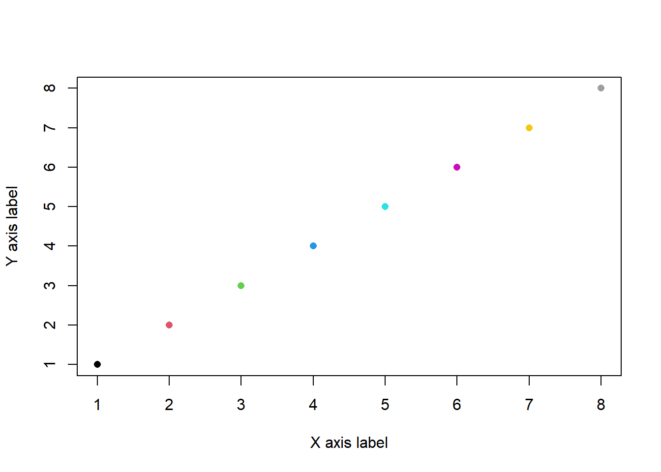
For example, we can create a plot with points where we specify the point type, point size, point colour and axis labels:
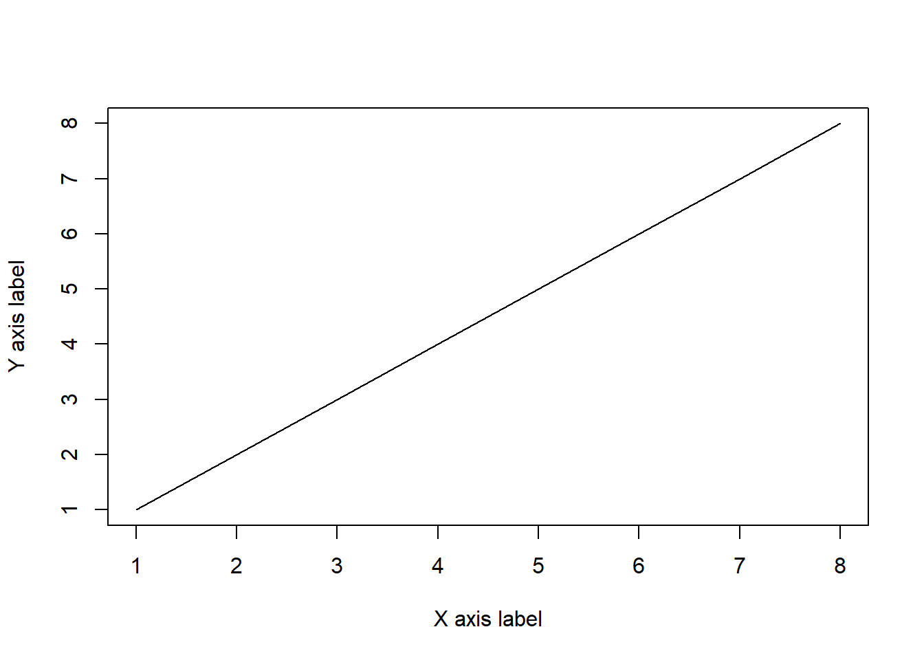
Or, we can draw the same data as a line graph:
Once a plot is created, different components can be added to a plot using the functions points, lines, rect to draw rectangles, polygon to add polygons, abline to quickly draw horizontal, vertical or sloped lines. Furthermore, the legend function allows to add a plot legend, the axis function draws plot axes, where you can specify the axis labels and ticks; the box function draws a box around the current plot in the given colour and line-type, and several functions can be used to add text to an existing plot: title adds labels to a plot, text adds labels at specific coordinates, and mtext writes text in the margins of a plot.
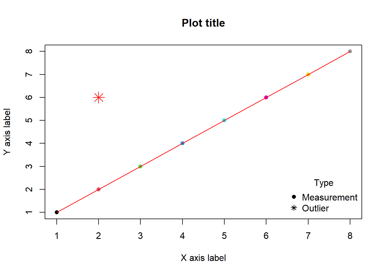
For example, we can plot some points, add a line, add another point and add a plot title and legend:
plot(1:8, 1:8, pch=16, cex=1, col=1:8, xlab="X axis label", ylab="Y axis label")
lines(1:8, 1:8, col="red")
points(2, 6, pch=8, col="#ff0000", cex=2)
title("Plot title")
legend(x="bottomright", title="Type", legend=c("Measurement","Outlier"), pch=c(16, 8), bty="n")