As mentioned above, each geometric function will by default inherit
the mapping aesthetics as defined in the default plot specification.
However, by setting the function argument inherit.aes of
the geometric function to FALSE, you can make explicit that
the default specification should not be inherited. Then, you can provide
the mapping aesthetics to the geometric function explicitly, and no
aesthetics will be inherited from the main plot. Here, you still need to
define a smooth line per species, so instead of setting the input
argument color in the aes function, consider
specifying the group input argument.
Visualizing data using ggplot2
Overview
Today’s goal: to get used to the basic grammar of graphics for efficient exploration and visualization of datasets using the ggplot2 package, part of Tidyverse.
Resources
- R4DS: chapters 1
- Data Carpentry - visualization using gpplot2
Packages
Main functions
Cheat sheets
Visualizing data is essential for exploring patterns in data and for communicating results. Although R does provide built-in plotting functions, the tidyverse package provides a consistent and more powerful way to do so. The ggplot2 library (part of core tidyverse) implements the Grammar of Graphics, making it particularly effective for describing how visualizations should represent data. Learning this library will allow you to make nearly any kind of (static) data visualization, customized to your exact specifications.
1 Grammar of Graphics
Just as the grammar of language helps us construct meaningful sentences out of words, the Grammar of Graphics helps us to construct graphical figures out of different visual elements. This grammar gives us a way to talk about parts of a plot: all the circles, lines, arrows, and words that are combined into a diagram for visualizing data, including:
- the data being plotted;
- the geometric objects (circles, lines, etc.) that appear on the plot;
- a set of mappings from variables in the data to the aesthetics (appearance) of the geometric objects;
- a statistical transformation used to calculate the data values used in the plot;
- a position adjustment for locating each geometric object on the plot;
- a scale (e.g., range of values) for each aesthetic mapping used;
- a coordinate system used to organize the geometric objects;
- the facets or groups of data shown in different plots.
ggplot2 organizes these components into layers, where each layer has a single geometric object, statistical transformation, and position adjustment. You can think of each plot as a set of layers, where each layer’s appearance is based on some aspect of the dataset.
2 The Basics
In order to create a plot, you will have to:
- call the
ggplot()function, which creates a blank canvas; - specify the data that will be used, using the
dataargument (e.g., adata.frameortibble); - specify the aesthetic mapping of objects, using the
aesfunction to themappingargument, which specifies the content of the objects and visual effects (e.g., the variables that should be plotted on the x and y axis, the size and colour of the object); - add layers to the plot that are geometric objects using one of the
many
geom_<type>functions (multiple geometries can be combined into a single plot).
ggplot2 has one general graphing template:
ggplot(data = <DATA>,
       mapping = aes(<MAPPINGS>)) +
  <GEOM_FUNCTION>()
Additional functions can be added to this base template. Today, we will work on various types of graphs/geometries:
- scatterplots (
geom_point); - barplots (
geom_bar); - boxplots (
geom_boxplot); - histograms (
geom_histogram); - density plots (
geom_density).
Inheritance
By default, a geometric function (e.g., geom_point)
inherits the input supplied to arguments data and
mapping from the default plot specification (i.e., as
specified in the ggplot() function call) when they are not
explicitly given as input to the geometric function itself. Thus, using
the general graphing template as shown above, we can create the same
plot in different ways:
# Both data and mapping are inherited by the geometric function
ggplot(data = <DATA>,
       mapping = aes(<MAPPINGS>)) +
  <GEOM_FUNCTION>()

# Data is inherited by the geometric function, but mapping is supplied directly
ggplot(data = <DATA>) +
  <GEOM_FUNCTION>(mapping = aes(<MAPPINGS>))

# No information is inherited by the geometric function but supplied directly to it
ggplot() +
  <GEOM_FUNCTION>(data = <DATA>,
       mapping = aes(<MAPPINGS>))
Today, we will explore a dataset of aboveground biomass in forests across Europe and Asia (Schepaschenko et al. 2017). The part of the dataset that we will use today consists of aboveground tree biomass (Mg dry mass per ha) of a plot, along with the dominant tree species in the plot, forest stand age, the origin of the forest stand (natural vs. planted) and environmental variables (climate and soil characteristics).
Exercise 2.2a
Download the file Forest biomass data.csv from Brightspace,
and save it to your project directory in the folder
data/raw/forest/. Start a new script and save it with a clear
and meaningful name. To start exploring the data, load the “tidyverse”
package, and import the csv file into a tibble that you assign the name
dat. If you do not remember how to do this, check the
tutorial of day 1 (see here). Inspect the
object dat by printing it to the console.
# load tidyverse packages
library(tidyverse)

# Load data (after setting the working directory!)
dat <- read_csv("data/raw/forest/Forest biomass data.csv")

# Inspect by printing it to the console
dat
## # A tibble: 3,733 × 15
## Plot_ID Tree_species Species_code Species Origin Site_index Stand_age Height DBH Tree_density Growing_stock AGB Temp_annual Precip_annual CEC_Soil
## <dbl> <chr> <chr> <chr> <chr> <dbl> <dbl> <dbl> <dbl> <dbl> <dbl> <dbl> <dbl> <dbl> <dbl>
## 1 6 Pinus sylvestris pisy pine Natural 6 35 14.3 12.8 2250 211 98.4 -0.158 465 35
## 2 8 Pinus sylvestris pisy pine Planted 7 12 3.4 3.2 2350 5.2 10.3 -0.158 465 35
## 3 9 Pinus sylvestris pisy pine Planted 8 14 4 3.8 2290 7.1 12.9 -0.158 465 35
## 4 14 Pinus sylvestris pisy pine Natural 9 37 6.5 5.9 8700 80 61.6 1.70 323 25
## 5 23 Betula spp besp birch Natural 8 40 12 13 1356 102 68.2 0.788 700 41
## 6 24 Populus tremula potr aspen Natural 8 30 9 10 2331 96 52.4 0.788 700 41
## 7 111 Betula spp besp birch Natural 9 60 13.5 13.8 1283 166. 112. 0.788 700 41
## 8 126 Pinus sylvestris pisy pine Natural 9 60 12 11.5 2825 178. 124. 1.59 371 47
## 9 127 Pinus sylvestris pisy pine Natural 8 40 11 10.2 2940 139. 110. 1.59 371 47
## 10 131 Pinus sylvestris pisy pine Natural 10 98 15 22 392 115 65.4 -6.70 554 57
## # ℹ 3,723 more rows3 Scatterplots
When visualizing two continuous variables, a scatter plot works best. This piece of code generates a scatter plot of aboveground biomass (AGB) against stand age:
ggplot(data = dat,
       mapping = aes(x = Stand_age, y = AGB)) +
  geom_point()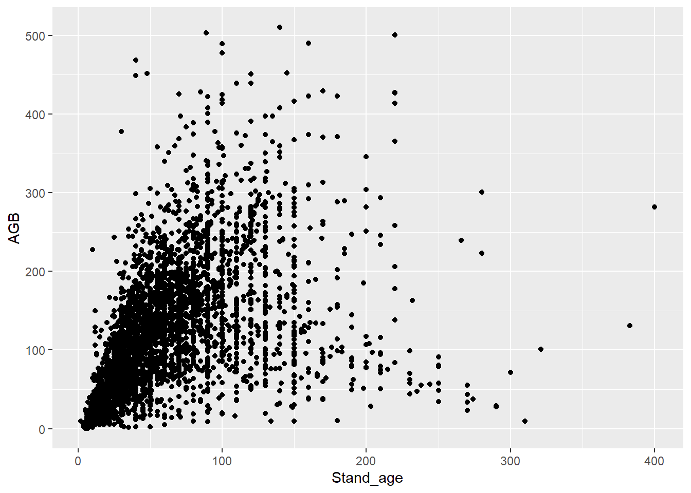
Part of the large variation in AGB in forests may result from species-to-species differences. The column “Species” indicates the dominant tree species in a plot.
Exercise 2.3a
Make a scatterplot with a different colour for each tree species.
ggplot(data = dat,
       mapping = aes(x = Stand_age, y = AGB, color = Species)) +
  geom_point()
4 Smooth lines
Typically, AGB increases with forest stand age, as biomass gradually
builds up over time, until it reaches an asymptote. You can fit a smooth
line through the points with geom_smooth:
ggplot(data = dat,
       mapping = aes(x = Stand_age, y = AGB)) +
  geom_point() +
  geom_smooth()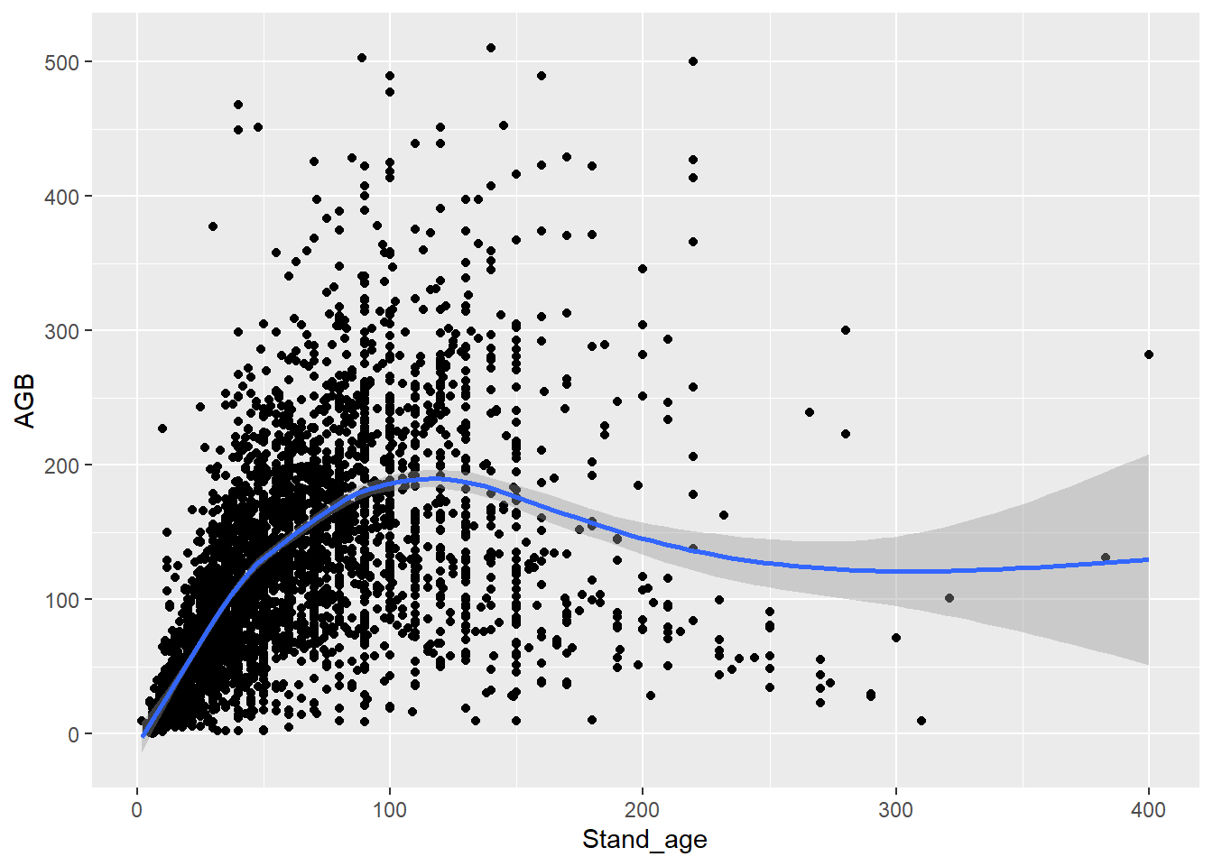
geom_smooth by default uses the ‘gam’ smoothing method:
the generalized additive model. However, we can specify the
method to use via the "method" argument. A straight line (a
linear model; "lm") can be included in the following
way:
ggplot(data = dat,
       mapping = aes(x = Precip_annual, y = AGB)) +
  geom_point() +
  geom_smooth(method = "lm")
We will look further into fitting linear models next week.
Exercise 2.4a
Add a smooth line per species, with different colour for each species
(but the same colour for the line and points within a species). ggplot(data = dat,
mapping = aes(x = Stand_age, y = AGB, color = Species)) +
geom_point() +
geom_smooth()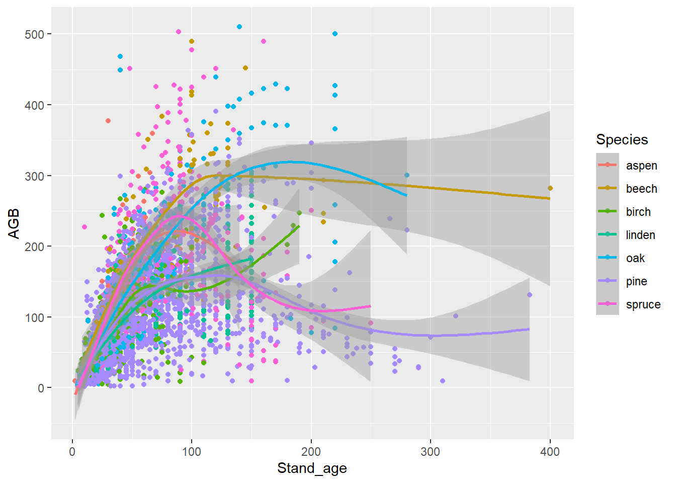
ggplot(data = dat,
       mapping = aes(x = Stand_age, y = AGB, color = Species)) +
  geom_point() +
  geom_smooth(mapping = aes(x = Stand_age, y = AGB, group = Species),
              inherit.aes = FALSE)
Alternatively, you can specify some mapping aesthetics in the global
ggplot specification, and some other aesthetics in the
location geom_ specification; the other mapping aesthetics
that the geom needs will then be inherited from the main plot
specification, e.g.:
# Or, alternatively:
ggplot(data = dat,
       mapping = aes(x = Stand_age, y = AGB)) +
  geom_point(mapping = aes(color = Species)) +
  geom_smooth(mapping = aes(group = Species))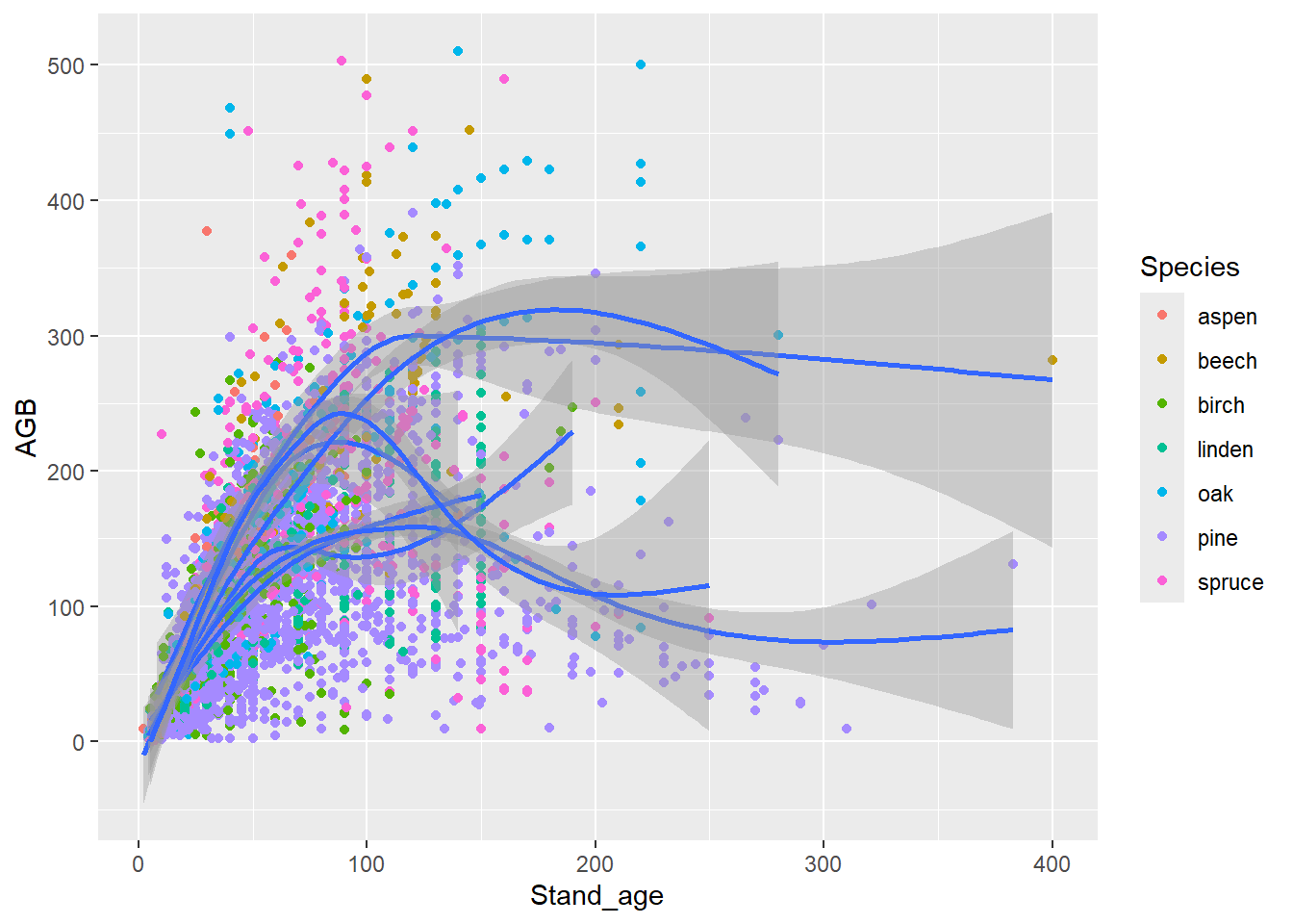
Exercise 2.4b
Make graphs of AGB against annual rainfall (the Precip_annual column)
for one species: aspen (Species). Let the size of the symbols vary with
stand age, and add a regression line to the (geom_smooth
with method = "lm") without a confidence interval (set
argument se = FALSE in geom_smooth). Does AGB
vary with annual rainfall? Select a subset of the dataset with aspen
only.
To make a subset of a data.frame or tibble, you can use the base R
subset function. For example, this code assigns the subset
of the data for pine to an object called dat_aspen:
dat_aspen <- subset(dat, Species == "aspen")Later this week we will practice the tidyverse way of subsetting data.
ggplot(data = dat_aspen) +
  geom_point(mapping = aes(x = Precip_annual, y = AGB, size = Stand_age)) +
  geom_smooth(mapping = aes(x = Precip_annual, y = AGB),
              method = "lm", se = FALSE)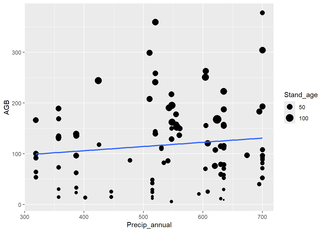
5 Barplots
When visualizing differences between group means or counts, a barplot is useful. This piece of code generates a barplot of the number of plots for each dominant tree species:
ggplot(data = dat,
       mapping = aes(x = Species)) +
  geom_bar()
and this gives the same graph:
ggplot(data = dat) +
  stat_count(mapping = aes(x = Species))
geom_bar and stat_count are
interchangeable. The default value for stat (and thus also
for geom_bar) is a count of the values. To check which
stat is associated as a default with a geom, check the
help-file of the geom.
Exercise 2.5a
Make a barplot to compare the number of plots between planted forests
and forests that established naturally (the “Origin” column). Does this
pattern differ between tree species? ggplot(data = dat) +
geom_bar(mapping = aes(x = Origin))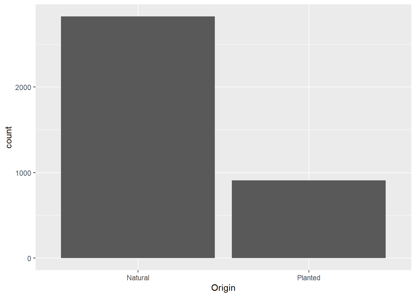
# with colour dependent on species
ggplot(data = dat) +
  geom_bar(mapping = aes(x = Origin, fill = Species))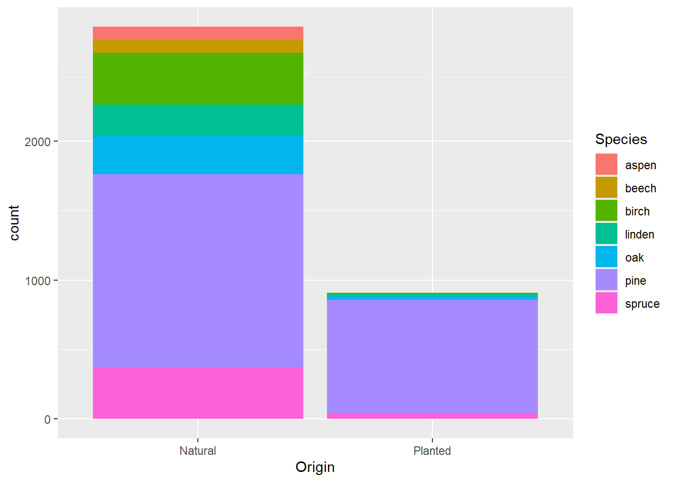
Exercise 2.5b
Adjust the code for the barplot to obtain the following graph:
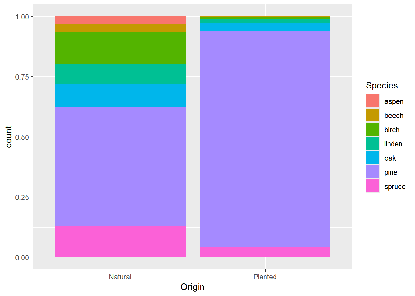
Check the help file, adjust the position argument in
geom_bar:
?geom_barggplot(data = dat) +
geom_bar(mapping = aes(x = Origin, fill = Species),
position = "fill")6 Boxplots
Boxplots (geom_boxplot), however, are more useful to
assess how values are distributed among groups. This is an example of a
boxplot of aboveground biomass per species:
ggplot(data = dat) +
  geom_boxplot(mapping = aes(x = Species, y = AGB))
Exercise 2.6a
Does AGB differ between planted and natural forests? Use a boxplot to
compare the forest types. ggplot(data = dat) +
geom_boxplot(mapping = aes(x = Origin, y = AGB))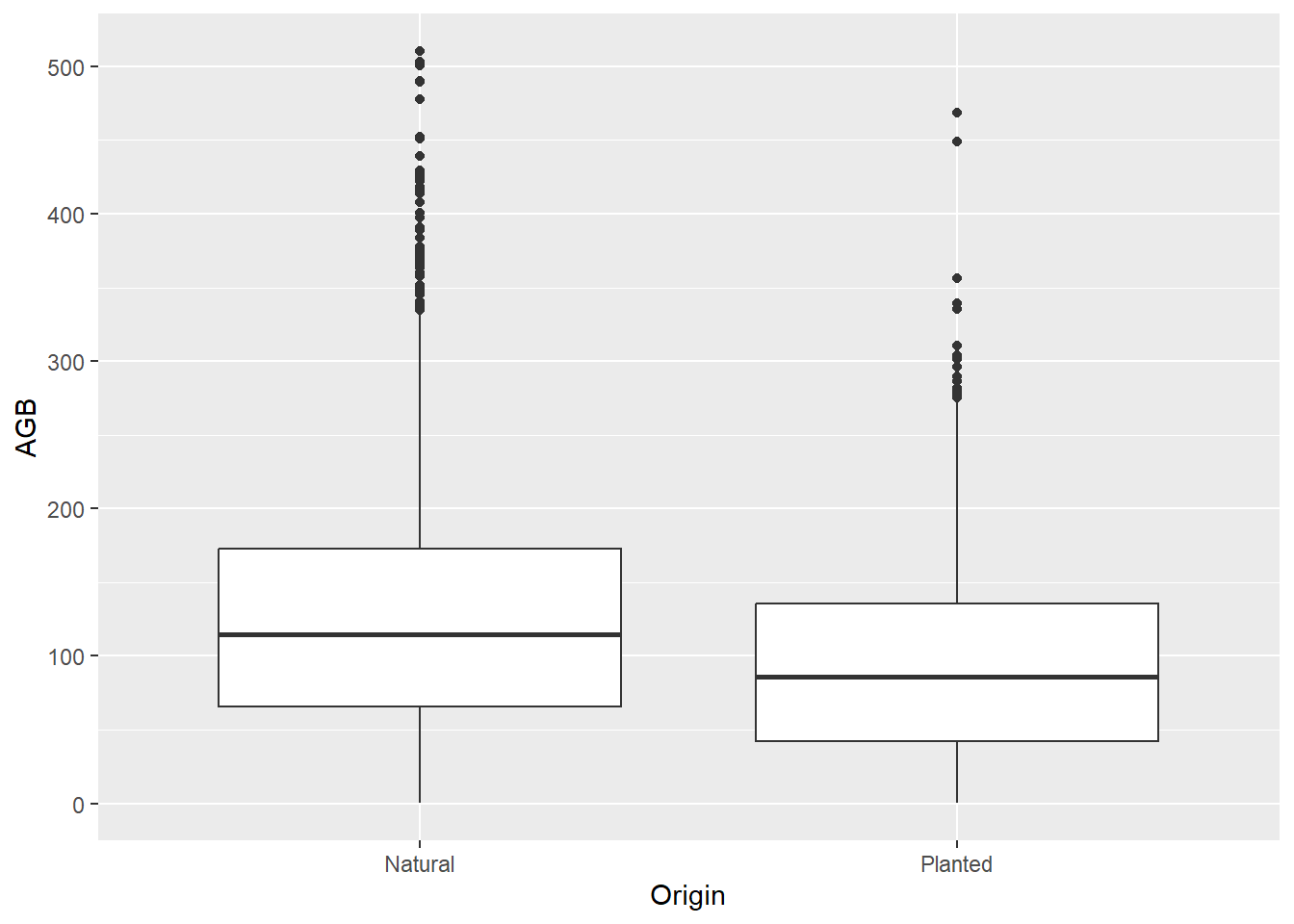
Exercise 2.6b
Make a boxplot to assess differences in AGB among species, then add in
differences between forests that are planted and that originated
naturally. Are differences in AGB between planted and natural forests
consistent among the dominant tree species? ggplot(data = dat) +
geom_boxplot(mapping = aes(x = Species, y = AGB, color = Origin))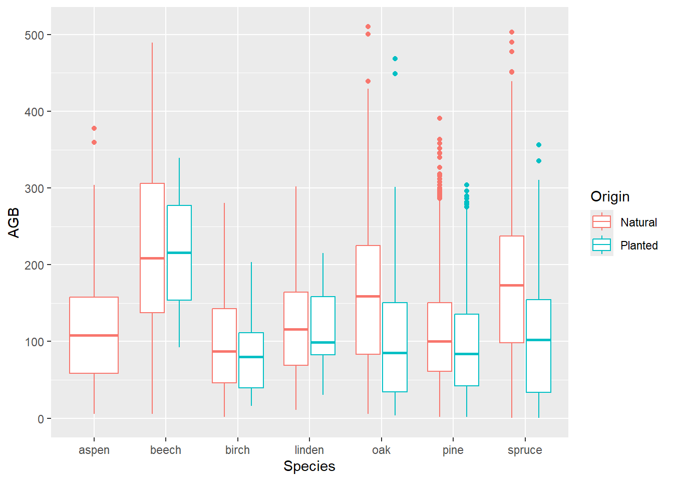
Exercise 2.6c
It is possible to flip the x and the y axis, for example to make graphs
more legible. Adjust the boxplot above by including scientific names
(column “Tree_species”), and to flip the x and the y axis. by using the function coord_flip()!
ggplot(data = dat) +
  geom_boxplot(mapping = aes(x = Tree_species, y = AGB, color = Origin)) +
  coord_flip()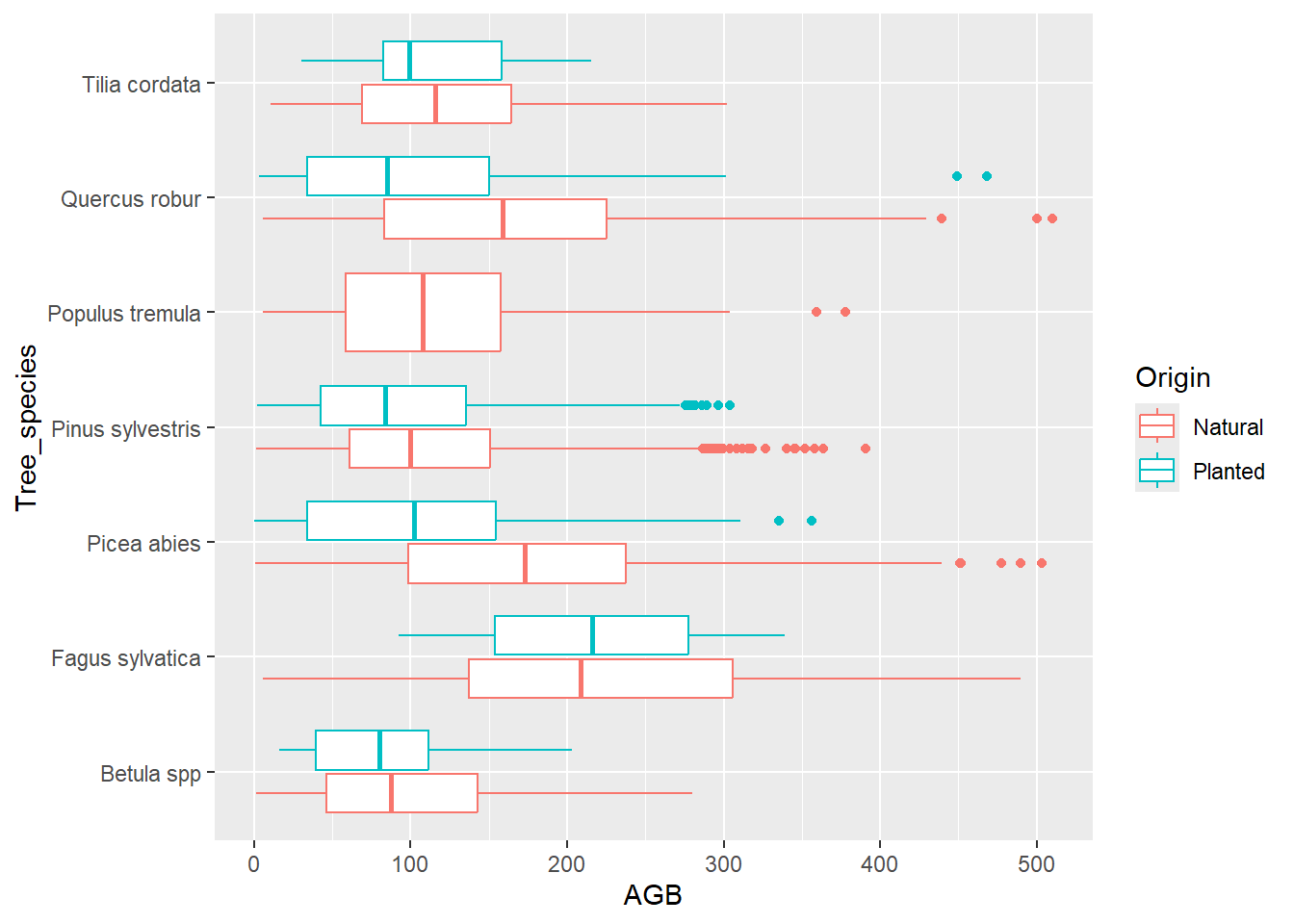
7 Count/density plots
To assess how a variable is distributed, histograms
(geom_histogram) or density plots
(geom_density) can be used:
ggplot(data = dat,
       mapping = aes(x = AGB)) +
  geom_histogram()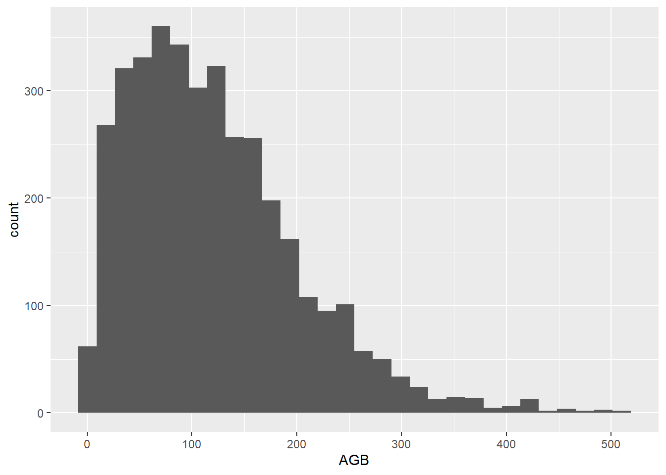
ggplot(data = dat,
       mapping = aes(x = AGB)) +
  geom_density()
Combining multiple graphs into one graph is possible, by adding two or more geom statements.
Exercise 2.7a
Make a plot that shows the density of AGB for aspen and oak. Tip: make
subsets first for the different species.
dat_aspen <- subset(dat, Species == "aspen")
dat_oak <- subset(dat, Species == "oak")

ggplot() +
  geom_density(data = dat_aspen,
               mapping = aes(x = AGB),
               col ="red") +
  geom_density(data = dat_oak,
               mapping = aes(x = AGB),
               col ="blue")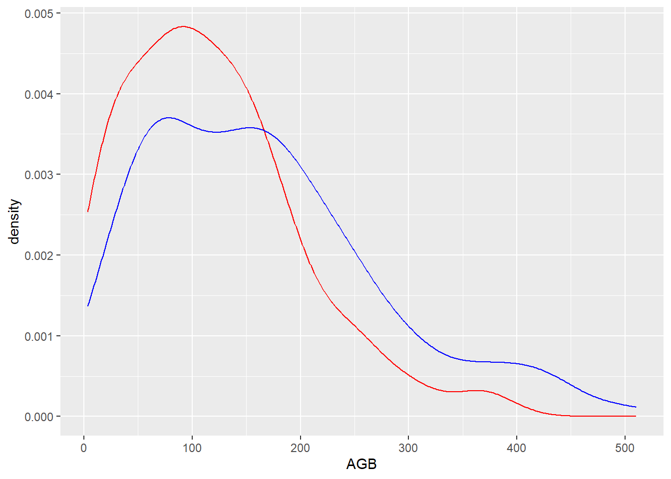
A similar plot can be generated without first splitting the data in
two different subsets, but by subsetting the dataset to only contain
these two species, and then plot a geometry per species (using e.g. the
“group” or “color” arguments). For this subsetting, we can either use
the %in% operator (which tests whether the element on the
left hand side has a value that occurs within a vector of values on the
right hand side), or by combining 2 separate conditional statements with
the OR operator |:
# Creating a similar plot with the %in% operator
ggplot(data = subset(dat, Species %in% c("aspen", "oak")),
       mapping = aes(x = AGB, color = Species)) +
  geom_density()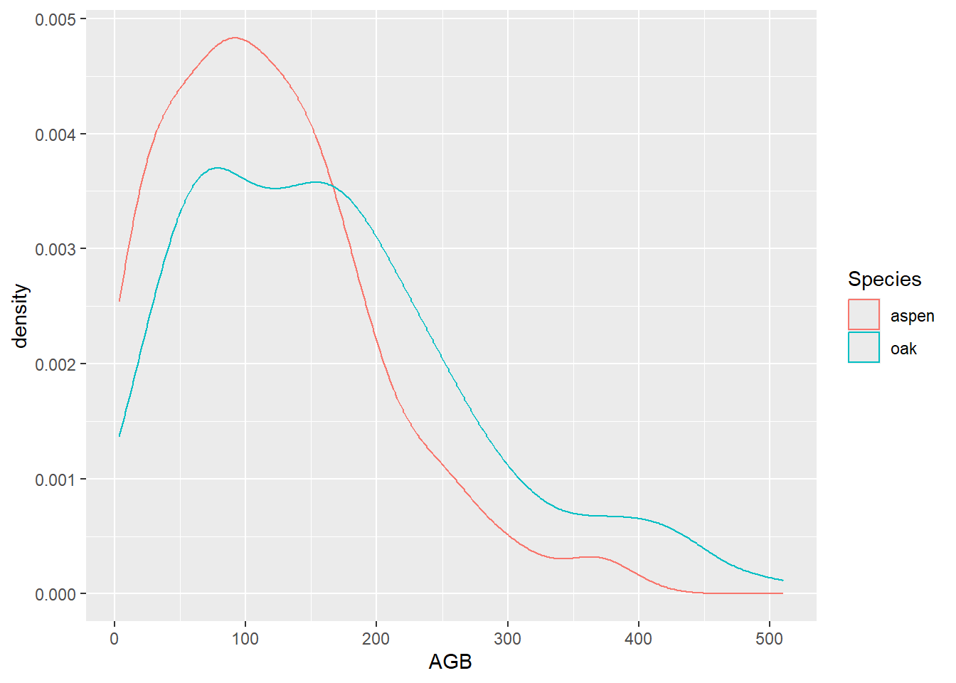
# Creating a similar plot with the OR operator (|)
ggplot(data = subset(dat, Species == "aspen" | Species == "oak"),
       mapping = aes(x = AGB, color = Species)) +
  geom_density()
Note that in the R for Data Science book, and from tomorrow onwards,
we will be using the tidyverse version of the subset
function: filter.
8 Plotting summaries
Several of the plots explored above do not show the raw data, but
rather a summary of the data: barplots and histograms by default show
counts, boxplots show the median, quantiles, outliers etc, and density
plots show, well…, densities. However, barplots are also often used to
compare average values among groups. To be able to include averages in a
barplot, averages have to be calculated first and then plotted, which
can be done with stat_summary (with the input argument
geom = "bar"). In ggplot2, geometries and calculated
statistics are related:
You only need to set one of stat and geom: every geom has a default stat, and every stat has a default geom.~ Hadley Wickham
Thus, geom_bar used above by default counts the number
of record in each class and then plots it. However, you can do the same
with function stat_summary, by first calculating the
summary statistic and then plotting it. The generic template of the
stat_summary function is:
ggplot(data = <data>, mapping = aes(...)) +
  stat_summary(fun = <function to summarize data>,
               geom = <geometry>)
where fun thus gets as input a function that summarizes
the data, while geom specifies the geometry that should be
used to plot it (e.g. “point”, “bar”, “line”).
Exercise 2.8a
Plot the average AGB per species using stat_summary with a
barplot as well as average AGB points in a single plot. ggplot(data = dat, mapping = aes(x = Species, y = AGB)) +
stat_summary(fun = mean, geom = "bar") +
stat_summary(fun = mean, geom = "point")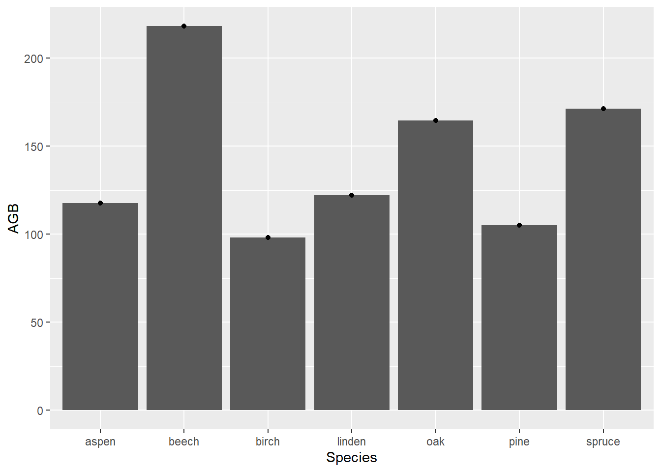
9 Facets
One of the most powerful aspects of plotting using ggplot2 is the
ease with which you can create multi-panel plots. With a single function
you can split a single plot into many related plots, either using the
facet_wrap or facet_grid options, where the
functions follow the same syntax pattern:
facet_wrap(~ panel_variable) and
facet_grid(row_variable ~ column_variable).
You can think of facet_wrap as a ribbon of plots that
arranges panels into rows and columns and chooses a layout that best
fits the number of panels. Thus, when there are 3 panels to be plotted,
facet_wrap will choose a 1-row layout as optimum, yet when
there are 4 panels to be plotted, facet_wrap will create a
2-row 2-column layout. Optionally, we can pass values to the
ncol or nrow arguments, to specify the number
of columns or rows, respectively, to use when plotting the facets.
The facet_wrap function also allows one to facet with
more than 1 variable, by separating multiple variables to base the
panels on by a +. For example:
ggplot(data = dat,
       mapping = aes(x = Stand_age, y = AGB)) +
  geom_point() +
  facet_wrap(~ Species + Origin)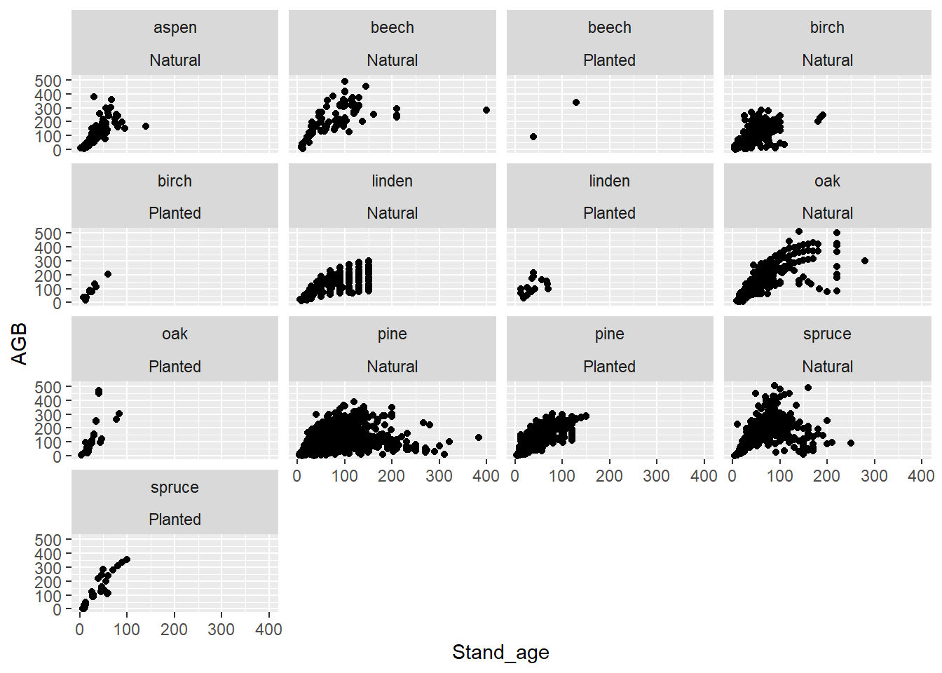
Rather than allowing facet_wrap to decide the layout of
rows and columns you can use facet_grid for organization
and customization. For example, we may want to use
facet_grid(Species ~ Origin) in order to plot the species
across rows, and the origin across columns. We can exclude a row or
column variable from facet_grid by replacing it with a
., e.g.: to exclude a column variable we can use
facet_grid(row_variable ~ .), and to exclude a row variable
we can use facet_grid(. ~ column_variable).
Exercise 2.9a
Make a scatterplot with “Stand_age” on the x-axis, “AGB” on the y-axis.
Make the colour of the points dependent on species. To make the graph
more legible, split the plot in a panel per species arranged over 4
columns, and include a smooth line (the default
geom_smooth) with all smooth lines in a single colour.
Use facet_wrap(), and check the help file:
?facet_wrapIn the facet_wrap function, you can use the
ncol argument to specify the number of columns the facets
should span.
ggplot(data = dat, mapping = aes(x = Stand_age, y = AGB)) +
  geom_point(mapping = aes(color = Species)) +
  geom_smooth() +
  facet_wrap(~ Species, ncol = 4)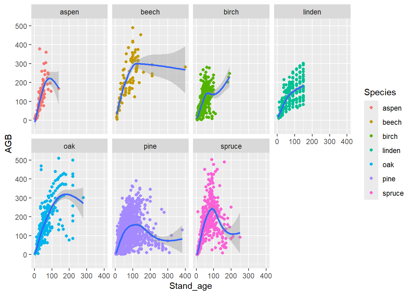
Exercise 2.9b
The site index (column “Site_index”) indicates the potential height of a
forest, but in reverse. A lower site index thus means a larger potential
height, due to better growing conditions. How does AGB change with site
index? Make a scatterplot with the average AGB per site index level, and
include a separate panel for each species. ggplot(data = dat) +
stat_summary(mapping = aes(x = Site_index, y = AGB),
fun = mean,
geom = "point",
col = "blue") +
facet_wrap(~ Species)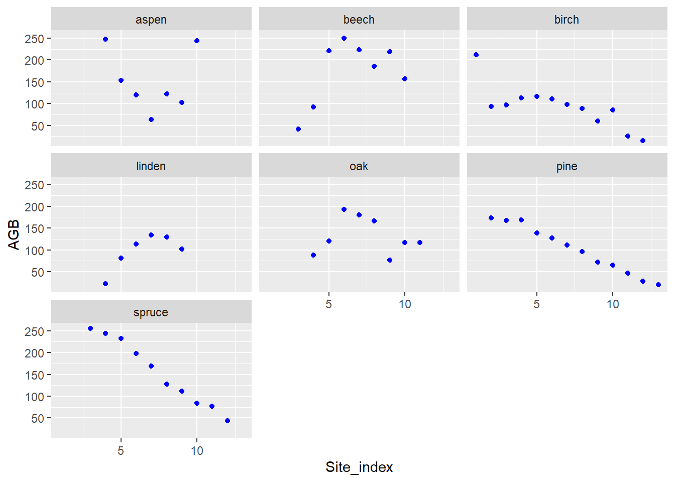
10 Styling
Above we have only highlighted some basic plotting functionalities of
ggplot2. In several ways we can further tweak the style of plots, for
example by controlling the titles and labels of a plot (see the
functions ggtitle, xlab, ylab,
labs), but also via the theme function (see
?theme for more information). Moreover, there are many
pre-set styling themes (see ?ggtheme), such as a greyscale
theme (theme_grey), a black and white theme
(theme_bw), a classic theme (theme_classic)
and others. For example, the figure of exercise 2.5a in a ‘classic’
theme is:
ggplot(data = dat,
       mapping = aes(x = Origin, fill = Species)) +
  geom_bar() +
  theme_classic()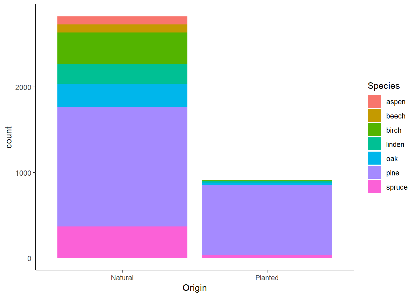
The ggthemes package provides some extra themes,
geoms, and scales for ggplot2. Amongst others, it provides
themes that replicate the looks of plots by The Economist
(theme_economist) and The Wall Street Journal
(theme_wsj). For example, let’s replicate the figure of
exercise 2.5a, but now with styling that looks like The Wall Street
Journal:
library(ggthemes)
ggplot(data = dat,
       mapping = aes(x = Origin, fill = Species)) +
  geom_bar() +
  theme_wsj()
11 Saving plots
A graph can be saved as a png file with ggsave. For
example, the following piece of code first creates a plot (it is
assigned to an object with name p), and then saves the
plots to the file “day2 - AGB figure.png” in folder “figs/”:
p <- ggplot(data = dat) +
  geom_point(mapping = aes(x = Stand_age, y = AGB)) +
  ggtitle("AGB in Eurasian forests") +
  xlab("Stand age (yr)") +
  ylab("AGB (Mg/ha)")
ggsave(filename = "figs/day2 - AGB figure.png", plot = p)
Here, three extra commands were added: ggtitle to add a
title to the graph, and xlab and ylab to
adjust the axis labels.
12 Extensions
In this tutorial, we have focussed on data visualization using ggplot2. As shown above, we can use the ggplot2 functions to easily create many different visualizations, including the automatic creation of facet plots etc. There are many other packages that extend the plotting capabilities that ggplot2 offers us, e.g. the packages ggExtra and ggfortify.
See here for a website dedicated to track and list ggplot2 extensions developed by R users in the community, with the aim to make it easy for R users to find developed extensions. Also see the gallery with extensions.
Because we have used ggplot2 today, we have focussed on
static visualization. However, there are other packages that
allow us to do dynamic (interactive) visualizations, e.g. using
the ggvis or
plotly packages. The
plotly package offers a handy function, ggplotly, to
convert a ggplot2 plot into a dynamic plotly visualization!
13 Challenge
Challenge
We came across a nice visualization on percentage of tree cover and population density in the US states, made by Andis Arietta submitted on Storytelling With Data:
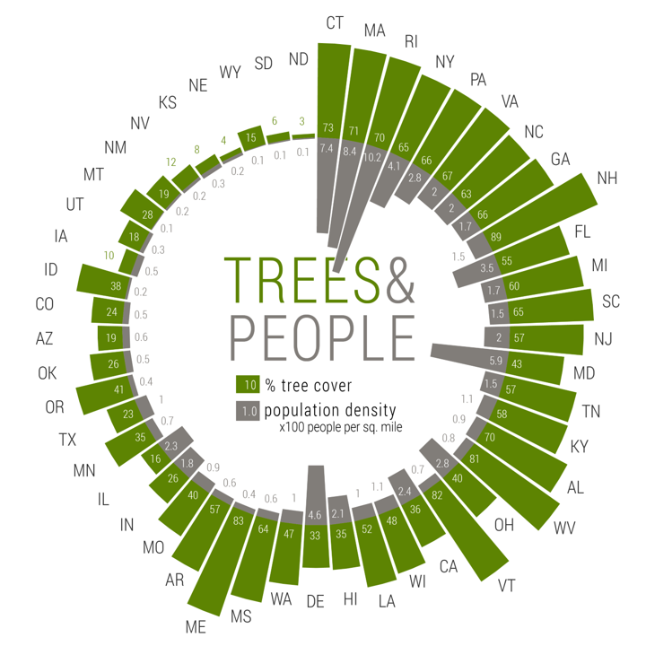
This radial graph shows population density data from the US Census Bureau, and tree cover data from Nowak and Greenfield (2012).
We have prepared a similar (but not exact) version of the data in “census.csv” as provided on Brightspace > Skills > Datasets > census, which includes the columns:
- “Rank”: a weighted rank of tree cover and population size, used for ordering the plot;
- “ABB”: abbreviation of the US states;
- “State”: name of the state;
- “Trees”: the percentage tree cover in the state;
- “Pop”: population density: number of people per square mile.
Use the skills trained above, and your own creativity, to create a plot like the one shown above. Try to make the plot as appealing as possible! Note that the plot as shown above also includes some elements that were not created in R (e.g. the text and legend at the center of the plot were added via Adobe Illustrator!).
To create a radial plot like the one shown above, you can consider
using the function geom_col in combination with
coord_polar. You can use the column “Rank” to re-order the
data while plotting. Also, to add text labels to a plot, you can
consider using the function geom_text.
See here for how Andis Arietta created the plot:
# Load data
census <- read_csv("data/raw/census/census.csv")

# Get new column Pop.10, as negative values, and in units 10 people / square mile
census$Pop.10 <- -census$Pop/10

# Plot
ggplot(data = census,
       mapping = aes(x = reorder(ABB, Rank))) +
  geom_col(aes(y = Trees), fill = "#5d8402") +
  geom_text(aes(y = ifelse(Trees >= 15, 8, (Trees + 10)),
                color = ifelse(Trees >= 15, 'white', '#5d8402'),
                label = round(Trees, 2)),
            size = 3)+
  geom_col(aes(y = Pop.10), fill = "#817d79") +
  geom_text(aes(y = ifelse(Pop.10 <= -15, -8, (Pop.10 - 10)),
                color = ifelse(Pop.10 <= -15, 'white', '#817d79'),
                label = round(Pop.10/10, 1)),
            size = 3)+
  geom_text(aes(y = ifelse(Trees <= 50 , 60, Trees + 15),
                label = ABB)) +
  coord_polar() +
  scale_y_continuous(limits = c(-150, 130)) +
  scale_color_identity() +
  theme_void() +
  theme(plot.margin = grid::unit(c(-15,-15,-15,-15), "mm"))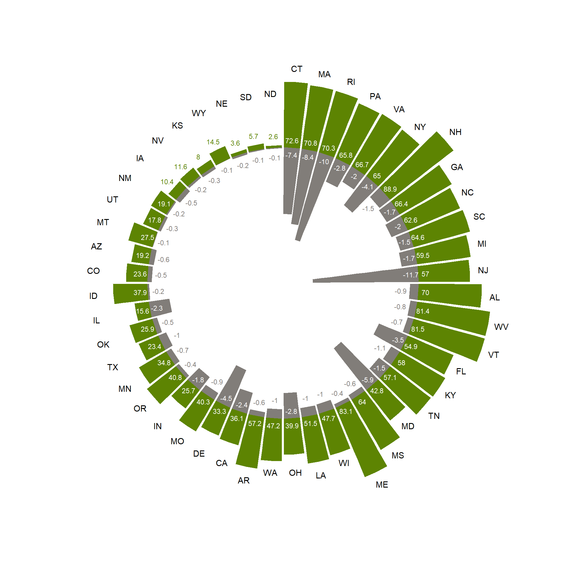
14 Submit your last plot
Submit your script file as well as a plot: either your last created plot, or a plot that best captures your solution to the challenge. Submit the files on Brightspace via Assessment > Assignments > Skills day 2.
Note that your submission will not be graded or evaluated. It is used only to facilitate interaction and to get insight into progress.
15 Recap
Today, we’ve explored data visualization using the ggplot2 package. Tomorrow, we are going to practice the main functions from the dplyr package to transform data.
An R script of today’s exercises can be downloaded here