Use the function cos to compute the cosine of a value.
Records with NA values is specified columns can be removed
using drop_na (or by using filter in
combination with is.na).
Unsupervised learning
Overview
Today’s goal: to apply unsupervised learning algorithms on the time series data prepared yesterday.
Resources
Packages
tidyverse lubridate Rtsne momentuHMM
Main functions
prcomp, Rtsne, kmeans,
hclust, fitHMM
Today, we are going to use the data that we prepared and explored yesterday, on the movement and activity of cattle (measured via GPS and accelerometer sensors as well as via visual observations) during an experiment at Carus research farm here in Wageningen, to train some unsupervised learning algorithms. We will be exploring dimension reduction methods (PCA and t-SNE) to find prevailing patterns in the data, and we will apply some clustering methods, e.g. K-means and hierarchical clustering, as well as unsupervised algorithms specific for time series data: Hidden Markov models.
1 Load and preparing the data
We continue with the data we worked with yesterday. We have run yesterday’s exercises with the code shown in yesterday’s answers to the exercises, and saved it to object “dat.rds” to Brightspace.
Exercise 12.1a
Download the file “dat_ts1.rds” from Brightspace > Time series
analyses > datasets > cattle, and store in an appropriate
folder (e.g. data/processed/cattle/). Load the tidyverse
package, and load the downloaded file into an object called
dat. Note that it is an .rds file, which can be read into R
with the function read_rds (see tutorial 1). library(tidyverse)
dat <- read_rds("data/processed/cattle/dat_ts1.rds")Before continuing, let’s rearrange the data a little bit.
Exercise 12.1b
Remove the columns dx, dy and
head from object dat. dat <- dat %>%
select(-c(dx, dy, head)) %>%
select(ID, dttm, everything()) # just for reordering columns2 Dimension reduction
As the first set of unsupervised learning algorithms, we are going to
apply two dimension reduction approaches to the data: principal
components analyses (PCA) and t-Distributed Stochastic Neighbour
Embedding (t-SNE). Both algorithms need a table (or matrix) as input
with only numeric data, thus subsetted to only the features of
interest. Therefore, let’s first subset the data selecting only specific
features, and by removing rows that contain NA values.
Exercise 12.2a
In this exercise, we want to only retrieve the numerical features of
interest and store it in a separate object called datx.
Thus, use object dat and remove columns ID,
dttm, burst, t,
label, x and y.
angle with the cosine
of angle. Then, filter the data by keeping only records
that have an angle that is not NA. Try to do
all steps in 1 pipe sequence, and assign the result to an object called
datx. datx <- dat %>%
select(-c(ID,dttm,burst,t,label,x,y)) %>%
mutate(angle = cos(angle)) %>%
drop_na(angle)The object datx now contains all the features that we
computed yesterday based on the GPS and accelerometer data (note that we
could have computed many more features).
Remember from the lectures that it is often advised to first
scale the features before doing analyses. Scaling here means to
remove the mean and then divide by the standard
deviation, so that all features are expressed on the same scale
(with zero mean and unit variance). The dplyr package provides a nice
function, across, which can be used inside a
mutate function, and in combination with
tidyselect functions for indexing columns by their names or
properties (e.g. you can use where(is.numeric) to
automatically select all numeric columns in a tibble). Using the
across function, you can apply a function to several
columns in one statement, for example the following code scales all
numeric columns to zero mean and unit variance in dataset
dat:
dat %>%
  mutate(across(where(is.numeric), ~ (.x - mean(.x)) / sd(.x)))
Note that the ~ symbol denotes a formula in which the
.x refers to column being processed. Instead of using the
across function in this way (using a formula with the
~ symbol and .x as column), you can also pass
in a function, e.g.:
# Define a function to standardize the data
fnScale <- function(x){
  y <- (x - mean(x)) / sd(x)
  return(y)
}

# Apply the function across all numeric columns
dat %>%
  mutate(across(where(is.numeric), fnScale))
Exercise 12.2b
Scale all numeric features in the tibble datx.
datx <- datx %>%
  mutate(across(where(is.numeric), ~ (.x - mean(.x)) / sd(.x)))
In the case of the dataset that we use this week, we actually have
labelled data: the behaviour of the cattle was visually observed and
annotated to several classes, here downscaled to the classes “foraging”,
“walking” and “idle” (the column label in
dat). To assist us in providing some meaning to
the patterns that the unsupervised machine learning algorithms will show
us, let’s keep the labels in memory.
Exercise 12.2c
Store the labels in the column label of dat in
an vector called datxLabels, after having filtered
out all the rows on which the column angle is
NA. Count the number of occurrences of each label. To retrieve the values from a column, you can use the
pull function, or the $ operator. To count the
number of occurrences, you may want to use the function
table or count.
To store the labels:
datxLabels <- dat %>%
  drop_na(angle) %>%
  pull(label)
Then, to count the number of occurrences of each label:
# using the table function on a vector
table(datxLabels)
## datxLabels
## grazing walking idle
## 1656 240 263# or count on a tibble
dat %>%
drop_na(angle) %>%
count(label)## # A tibble: 3 × 2
## label n
## <fct> <int>
## 1 grazing 1656
## 2 walking 240
## 3 idle 2632.1 PCA
Now that we’ve prepared the data (datx), and also stored
a matching vector with true (observed) labels
(datxLabels), let’s apply some dimension reduction
algorithm, PCA. There are multiple packages and functions that compute a
PCA, here we are going to use the function prcomp from the
stats package that is automatically loaded when you start
RStudio. Apart from a table with numeric values, the prcomp
function does not need additional input arguments (although you can
supply some optional argument values, see the helpfile of the
prcomp function).
Exercise 12.2d
Apply a PCA on the data datx, assign the result to an
object called datx_pca. Check the contents of the
datx_pca object, e.g. by printing it to the console, by
using names(datx_pca) or by using
summary(datx_pca). datx_pca <- prcomp(datx)
datx_pca## Standard deviations (1, .., p=10):
## [1] 2.0437206 1.1887108 1.1616227 1.0408751 0.8639934 0.7121532 0.5736013 0.4258363 0.3675481 0.2798058
##
## Rotation (n x k) = (10 x 10):
## PC1 PC2 PC3 PC4 PC5 PC6 PC7 PC8 PC9 PC10
## xacc_mean 0.037169211 0.1168051 -0.56243531 0.56752224 -0.347432867 0.448172320 -0.143425548 -0.02118836 0.01615148 -0.060920642
## xacc_sd -0.405963958 -0.1890052 -0.04519275 0.07075323 0.133530718 -0.251465092 -0.765468125 -0.21858203 -0.03530045 -0.276389369
## yacc_mean 0.375327231 -0.4044292 0.13759970 0.24112769 -0.054704303 -0.156912683 -0.003020708 0.01118408 0.73822604 -0.213925730
## yacc_sd -0.438084953 -0.1669035 -0.03852115 0.11340582 0.006235495 -0.016677265 0.567770657 -0.13053586 -0.08491595 -0.647262836
## zacc_mean 0.322703242 -0.3041226 -0.23602125 0.37142865 0.084276850 -0.568091497 0.143712058 -0.09346818 -0.47366783 0.161634150
## zacc_sd -0.432126056 -0.1702750 -0.03849030 0.17261652 -0.076446713 -0.174994576 0.019690786 0.81421018 0.08430956 0.214695749
## VeDBA_mean 0.005798483 -0.5220882 0.56100575 0.17160873 -0.247041063 0.427925606 -0.083179055 -0.03367593 -0.34962342 0.093671080
## VeDBA_sd -0.448861389 -0.1624421 -0.07143879 0.10997560 0.035954440 -0.006326124 0.207323994 -0.49455561 0.30347584 0.611505570
## step 0.092185560 -0.4736074 -0.40823435 -0.25170755 0.602165298 0.398467931 0.002952121 0.12371238 -0.01615637 0.015219142
## angle 0.012004246 -0.3383226 -0.34283059 -0.57380525 -0.648503482 -0.125375719 -0.012783822 -0.04369966 -0.01549639 -0.004401788names(datx_pca)## [1] "sdev" "rotation" "center" "scale" "x"summary(datx_pca)## Importance of components:
## PC1 PC2 PC3 PC4 PC5 PC6 PC7 PC8 PC9 PC10
## Standard deviation 2.0437 1.1887 1.1616 1.0409 0.86399 0.71215 0.5736 0.42584 0.36755 0.27981
## Proportion of Variance 0.4177 0.1413 0.1349 0.1083 0.07465 0.05072 0.0329 0.01813 0.01351 0.00783
## Cumulative Proportion 0.4177 0.5590 0.6939 0.8023 0.87691 0.92763 0.9605 0.97866 0.99217 1.00000The element sdev (which you can access using
datx_pca$sdev) contains the standard deviation associated
to each principal component. The element x (which you can
access using datx_pca$x) contains the computed principal
components themselves (stored in a matrix).
Exercise 12.2e
Plot a barplot of the element sdev and calculate the
fraction of total variance that is explained by the first 2
principal components. Then, convert the element x into a
tibble and add a column label that gets the values of the
earlier created datxLabels. Create a scatterplot (ggplot
with geom_point) with the first principal component on the x-axis and
the second principal component on the y-axis. Let the colour of the
points be determined by the label column. Do you see a
clear pattern in relation to the cattle’s activity? The function barplot can be used to create a barplot
from values, e.g. the sdev values. The fraction of total
variance that a principal component explains is its variance
(sd2) divided by the sum of the variances across the
principal components. The function cumsum computes a
cumulative sum across a vector of values, which may be handy when
computing the fraction of total variance explained by the first \(n\) principal components.
# Barplot
barplot(datx_pca$sdev)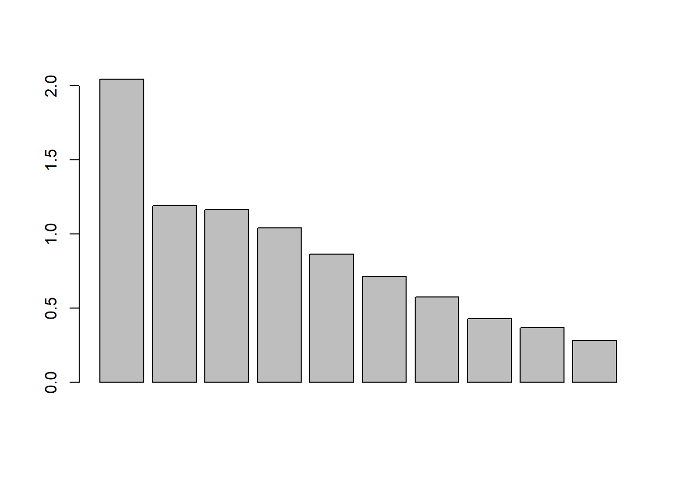
# Variance per axis
datx_pca$sdev^2 / sum(datx_pca$sdev^2)
## [1] 0.41767938 0.14130333 0.13493672 0.10834209 0.07464847 0.05071622 0.03290185 0.01813366 0.01350916 0.00782913# plot the cumulative explained variance
plot(seq_along(datx_pca$sdev),
100 * cumsum(datx_pca$sdev^2) / sum(datx_pca$sdev^2),
xlab = "Number of PC included",
ylab = "Cumulative variance explained (%)",
type = "b")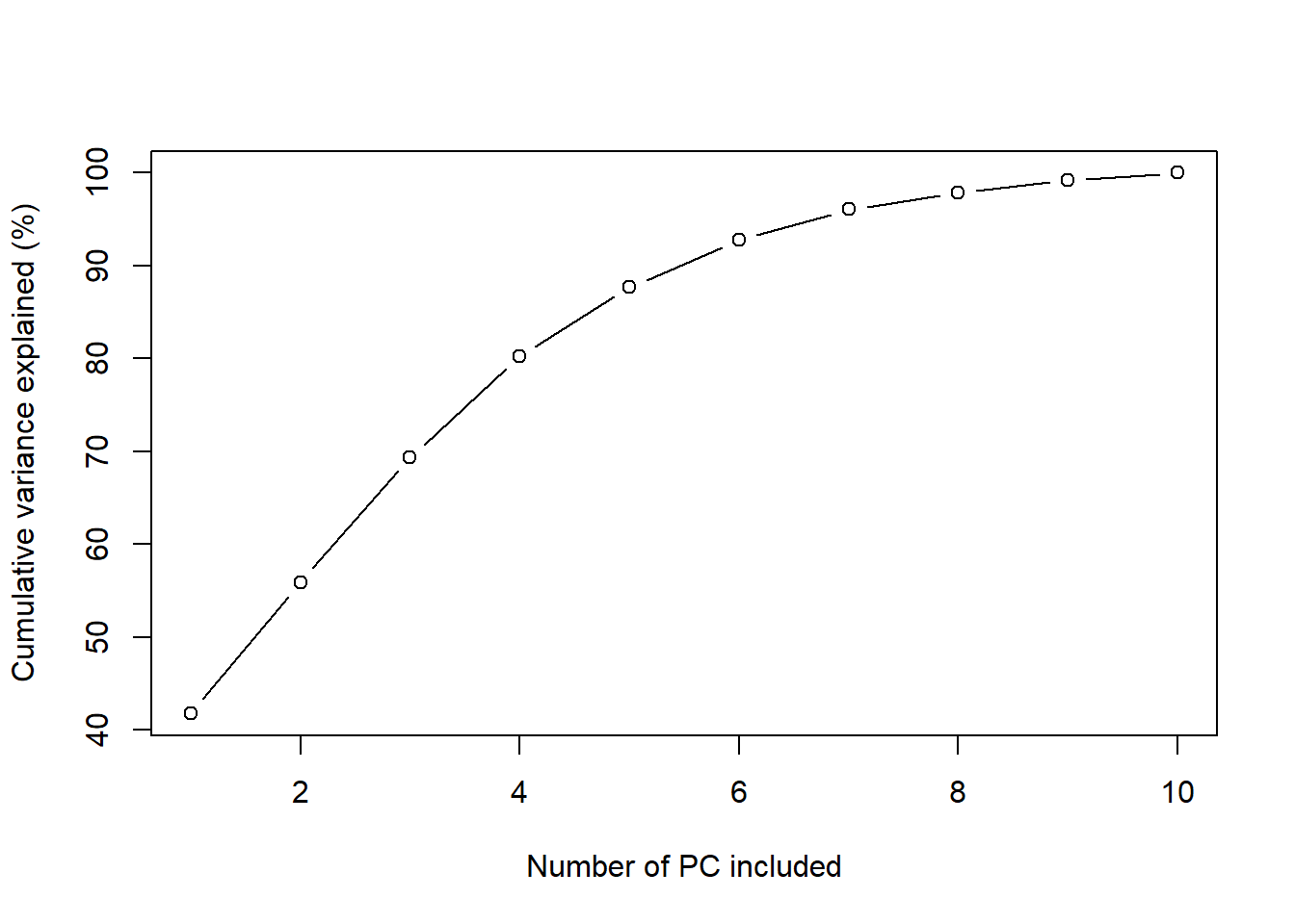
# Get the data as a tibble, with label as new column
datx_pcatbl <- as_tibble(datx_pca$x) %>%
  mutate(label = datxLabels)

# Plot the first 2 principal components
datx_pcatbl %>%
  ggplot(aes(x=PC1, y=PC2, col=label)) +
  geom_point() +
  coord_fixed() # to have a 1:1 ratio on x and y axis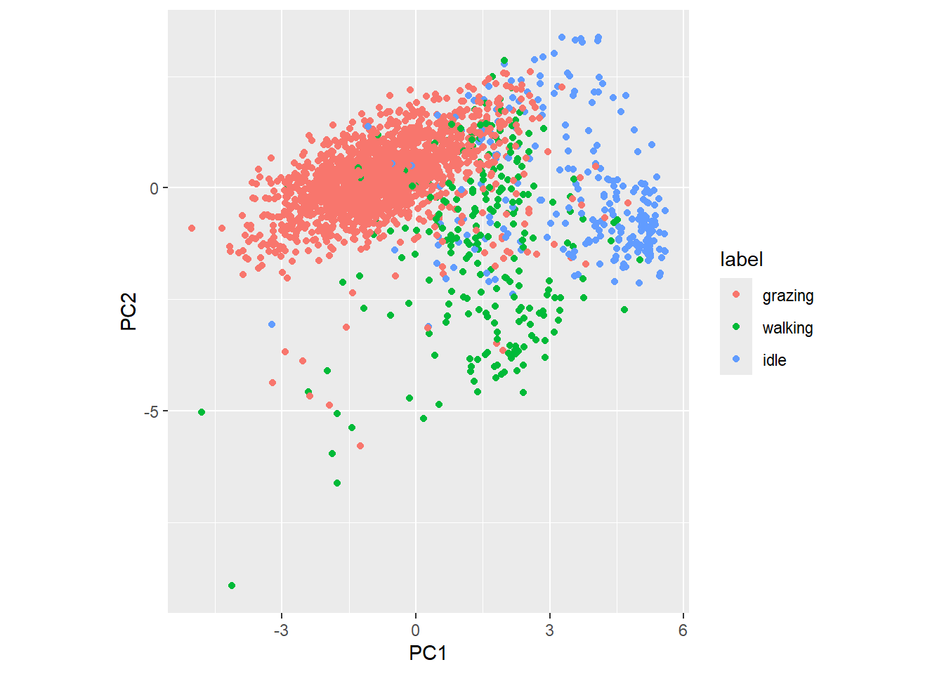
There seems to be quite some clustering of data for the 3 different behaviours.
The ggfortify
package provides a nice interface to plotting PCA results using ggplot
(using the function autoplot). When you run this code you
will get a nicer plot summarising the PCA results, including the
contribution of the individual features to the principal components and
the contribution of the plotted principal components to the total
variance.
library(ggfortify)
autoplot(datx_pca,
         data = tibble(label=datxLabels),
         colour = 'label',
         loadings = TRUE,
         loadings.colour = 'blue',
         loadings.label = TRUE,
         loadings.label.size = 4,
         loadings.label.colour = 'black')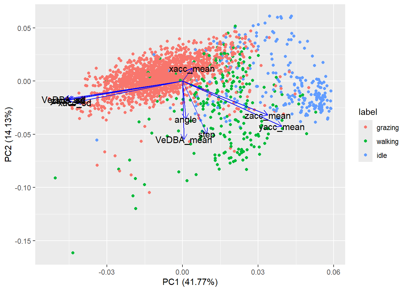
2.2 t-SNE
A relatively new dimension reduction approach is the t-Distributed
Stochastic Neighbour Embedding (t-SNE) proposed in 20081.
Whereas PCA is a linear dimension reduction approach, the t-SNE is
non-linear. Here, we will use the Rtsne function from a
package with the same name. Thus, install the package and load it. Check
the Rtsne help file via ?Rtsne. The argument
X should be a table (matrix, data.frame), where each row is
an observation and each column a variable (i.e. a tidy
dataset!). Via the dims argument, we can set the
dimensionality of the output (defaults to 2). There are other arguments
that we can supply, but now we let them at their default values (which
for our data will be fine).
Exercise 12.2f
Install and load the Rtsne package. Apply the
function Rtsne that performs the t-SNE to the data
datx, keep 2 output dimensions (argument dims)
and set the perplexity argument to the value 30 (which is
the default value). Assign the result to an object called
dat_tsne (running the algorithm may take half a minute or
so). Explore the object dat_tsne, e.g. using the
names function. Also, check the helpfile of the
Rtsne function (run ?Rtsne) and have a look at
the Value section (where the structure of the output
returned is explained).
Y of output dat_tsne into
a tibble, and add a column label that gets the values of
the earlier created datxLabels. Create a scatterplot
(ggplot with geom_point) with the first component of the
t-SNE on the x axis and the second component of the t-SNE on the y-axis.
Let the colour of the points be determined by the label
column. library(Rtsne)
dat_tsne <- Rtsne(datx, dims = 2, perplexity = 30)
names(dat_tsne)## [1] "N" "Y" "costs" "itercosts" "origD" "perplexity" "theta"
## [8] "max_iter" "stop_lying_iter" "mom_switch_iter" "momentum" "final_momentum" "eta" "exaggeration_factor"dat_tsne <- dat_tsne$Y %>%
as_tibble() %>%
mutate(label = datxLabels)
dat_tsne %>%
ggplot(aes(x=V1, y=V2, col=label)) +
geom_point() +
coord_fixed() # to have a 1:1 ratio on x and y axis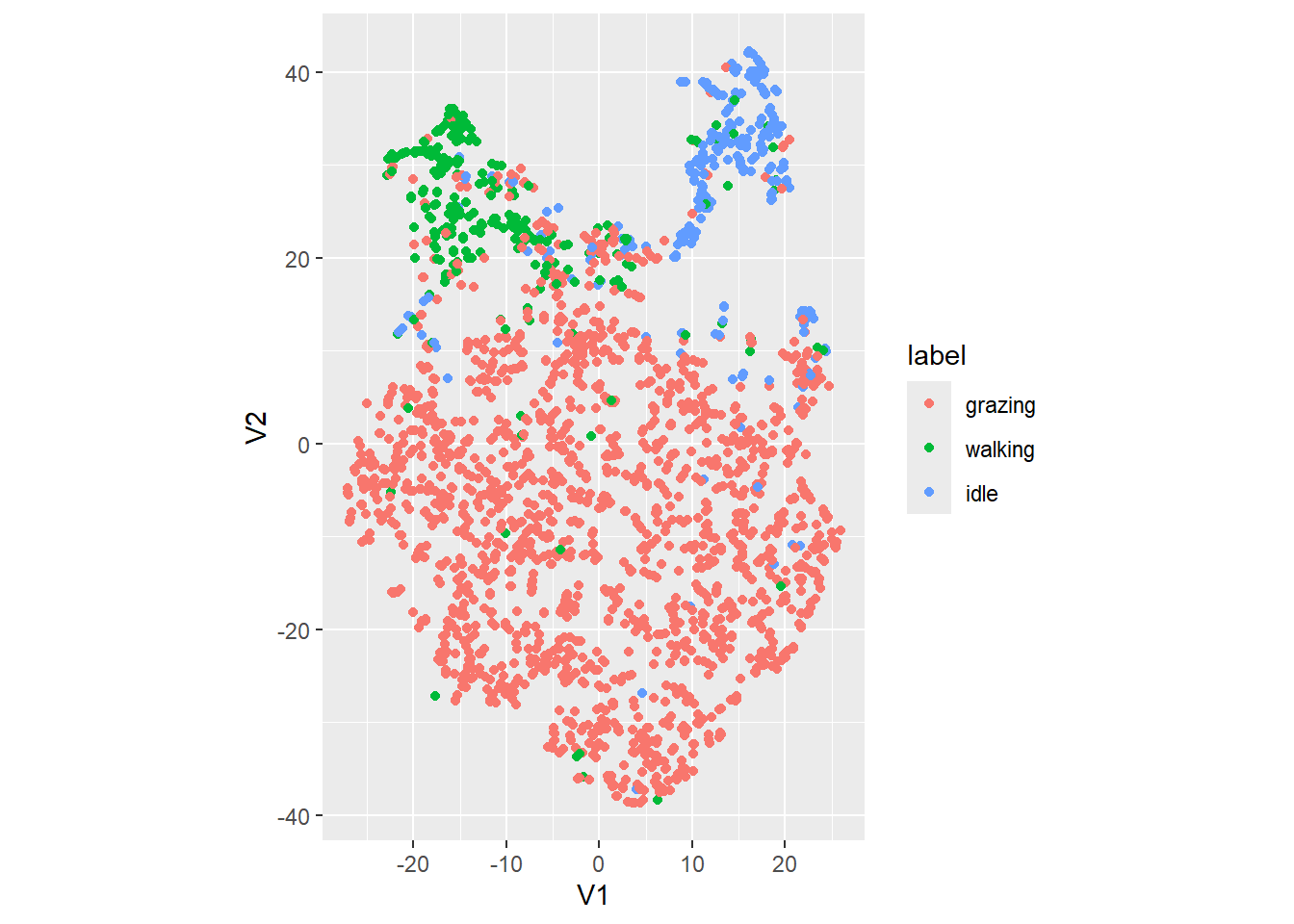
It seems to separate the clusters a bit better than the PCA does (although we are not doing a formal cluster analysis yet).
Exercise 12.2g
Rerun the t-SNE analyses, yet change the perplexity
parameter to value 1. This is a very low value for this parameter, which
should result in many small clusters, as the attraction force should
become very localized, yet the repulsive force very global. # Run t-SNE with updated perplexity parameter
dat_tsne2 <- Rtsne(datx, dims = 2, perplexity = 1)
# Plot the results
dat_tsne2$Y %>%
as_tibble() %>%
mutate(label = datxLabels) %>%
ggplot(aes(x=V1, y=V2, col=label)) +
geom_point() +
coord_fixed() # to have a 1:1 ratio on x and y axis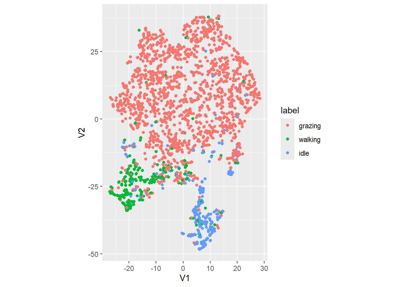
With a very low value of the perplexity parameter, the attraction force will become very local, and the repulsive force will become global, resulting in very many small clusters which will be far apart (i.e. the few points within individual clusters are close together, yet the other clusters are then relatively far apart [compared to the intra-cluster distances]).
3 Clustering
3.1 K-means clustering
The simplest clustering algorithm is K-means clustering,
where K is a number that should be chosen a priori. In
R, the kmeans function from the stats package
performs K-means clustering on a data matrix
(e.g. datx as computed above).
Exercise 12.3a
Apply the K-means algorithm to the data datx. Use
\(K=3\). Assign the result to an object
called k3. Retrieve the value of the K centers
(using the element k3$centers). Also, create the same plot
as the t-SNE exercise (a scatterplot of the the 2 t-SNE axes), but now
with the colour of the points indicating the assigned cluster according
to the K-means algorithm (using the element
k3$cluster). k3 <- kmeans(datx,
centers = 3)
dat_K <- dat_tsne %>%
mutate(cluster = factor(k3$cluster))
dat_K %>%
ggplot(aes(x = V1, y = V2, col = cluster)) +
geom_point() +
coord_fixed()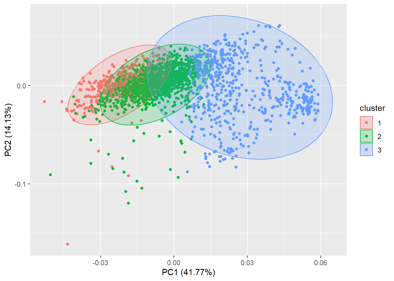
The cluster package offers a function to partition
(i.e. cluster) the data into \(k\)
clusters “around medoids”, a more robust version of K-means (which is
plotted using a PCA dimension reduction to 2 axes if we use the
autoplot function from the ggfortify package
as already used above):
library(cluster)
autoplot(pam(datx, 3), frame = TRUE, frame.type = 'norm')
3.2 Hierarchical clustering
Whereas K-means clustering is a fast and flat type
of clustering, hierarchical clustering is much slower because
it assigns each records to its own unique cluster, and evaluates the
dissimilarity between each pair of clusters. It will merge together the
2 clusters that are most similar, and will continue to do so until all
records belong tot the same cluster. The results of a hierarchical
clustering can be shown as a dendrogram, i.e. a tree diagram.
We will use the hclust function from the stats
package. The hclust function needs a dissimilarity
structure as produced by the function dist as input. Thus,
with input data x, you can apply hierarchical clustering
using hclust(dist(x)). The dist function has
the method input argument, which can include “euclidean” or
“manhattan” (or another distance metric) and denotes the metric used to
compute distances between points. The hclust function
performs agglomerative hierarchical clustering and also has a
method argument, yet this is the argument to specify the
type of linkage method: e.g. “complete”, “single”, “average” or
one of the other alternatives.
Exercise 12.3b
Apply hierarchical clustering to the object datx, with
Manhattan distances and complete linkage. Store the output as object
with name hc, and plot the result. To plot the output of hclust, simply use the
plot() function.
hc <- hclust(dist(datx, method = "manhattan"), method = "complete")
plot(hc)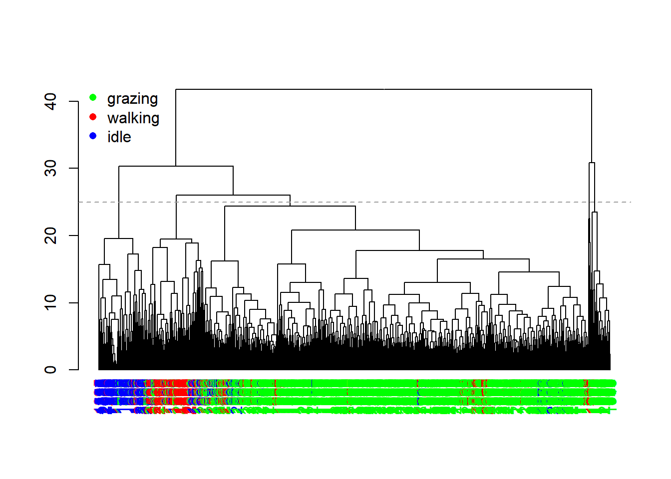
The plot from the previous exercise does not look very nice yet.
Using the dendextend package, we can plot the dendrogram a bit
nicer. The following code colours the records based on their observed
behaviour as stored in the object datxLabels:
library(dendextend)
dend <- as.dendrogram(hc)
colCodes <- c(grazing = "green", walking = "red", idle = "blue")
labels_colors(dend) <- colCodes[as.integer(datxLabels)][order.dendrogram(dend)]
plot(dend)
legend(x = "topleft", bty = "n", pch = 16, col = colCodes, legend = names(colCodes))
abline(h = 25, col = 8, lty = 2)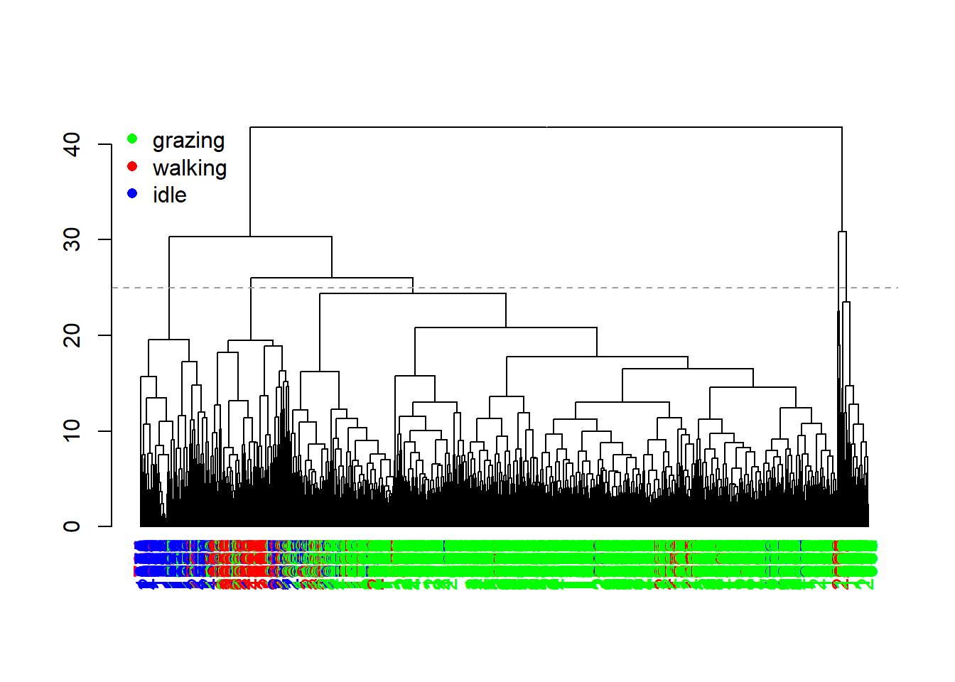
The dendrogram now shows us a bit more insight. We see that there is quite a bit of clustering in the features associated to the different behaviour, although there still is some mixing.
Since hierarchical clustering does not yield a specific number of
clusters, but rather a tree-like hierarchy of similarity, we need to
prune the tree in order convert it into discrete clusters. For
this we can use the cutree function, here at a height of 25
(the horizontal grey dashed line in the previous plot):
table(behaviour=datxLabels, cluster=cutree(hc, h = 25))## cluster
## behaviour 1 2 3 4 5
## grazing 1521 73 45 7 10
## walking 64 7 154 4 11
## idle 38 0 37 1 187We notice that there are more clusters found (using this height at which we cut the tree) than there are behaviours, yet also that clusters correlate with specific behaviours.
3.3 Hiden Markov models
The last class of algorithms that we will look at today are Hidden Markov models (HMM): a model that assumed that the process with unobservable (i.e. hidden) states (i.e., the clusters, or latent behaviours) follows a Markov chain (i.e. a sequence of possible events in which the probability of each event depends only on the state attained in the previous event). There are several packages in R that implement HMMs; here we will use the momentuHMM package (see this paper).
Before we can fit a HMM using the momentuHMM package, we have to
prepare the data using the prepData function. Input to this
function can be a data.frame (or tibble). By specifying the
coordNames argument (e.g. the x and y
coordinates), the prepData function will calculate the
movement statistics step and angle. However,
as we have already done so yesterday ourselves, and as they are now
columns in our data object dat, we can set the
coordNames argument to NULL so that this step
will be ignored in prepData. The function
prepData assumes that there is a column with the name
ID, which should contain the identifier of the time-series.
In our object dat we actually have 2 keys: ID
and burst, so we should first merge them into a single
column ID, and then prepare the data using
prepData.
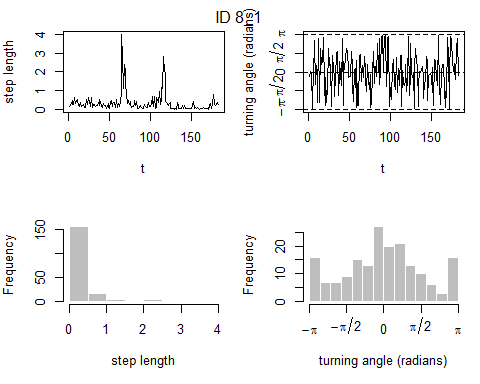
Exercise 12.3c
Install and load the momentuHMM package, and prepare
the object dat for analyses using the prepData
function. Assign the output to an object called preppedDat.
Plot the object preppedDat (using the plot
function). To merge 2 columns into a single column, we can use either the
unite function in dplyr, or the str_c
function in stringr. When you use plot(preppedDat)
all time-series will be plotted, but you can choose to plot only a
specific time-series by using the argument animal,
e.g. plot(preppedDat, animals = 2).
library(momentuHMM)

preppedDat <- dat %>%
  drop_na(angle) %>%
  unite("ID", c(ID, burst)) %>%
  prepData(coordNames = NULL)
plot(preppedDat, animals = 2)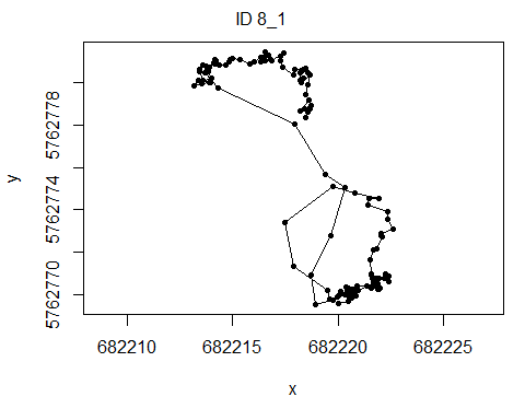
Now that we’ve prepared the data for the package momentuHMM, we can
fit our fist HMM. the function fitHMM can be used for this.
The function needs several inputs:
datathe data as prepared abovenbStatesthe number of hidden states we want to estimatedista named list, where the names of the elements refer to the column names indatathat will be the response variables, and their values indicating their probability distributions. Supported distributions arenormfor Gaussian distributions (e.g. the accelerometer-derived features),gamma,weibullfor distributions with values > 0 (e.g.step), andvmorwrpgauchyfor the von Mises distribution and wrapped Gauchy distribution: distributions that can be used for angular/circular features (e.g.angle). For most distributions, we need 2 parameters for each state (e.g.normhas mean and sd as parameters), yet the circular distributions can be supplied with either 1 or 2 parameters (the angular mean and dispersion): if providing only 1 parameters,fitHMMwill assume that the angular mean of the distribution is 0.Par0is a named list containing vectors of initial state-dependent probability distribution parameters for each data stream specified indist.
Let’s fit a 3-state HMM with 2 response variables: step
and angle. We thus need to specify their distributions
(let’s use gamma and wrpcauchy), and we have
to set their initial values. For angle lets only provide 1
parameter per state, thus assuming that the angular mean is 0 (i.e. on
average the animals move forward). This parameter is the
concentration parameter, which is between 0 and 1, where a
higher value means that the angles are more concentrated around its mean
(thus here: movement is more straightforward).
Let’s estimate the initial values of the parameters using the mean
and standard deviation of the step lengths, and the mean
cosine of angle:
mean(preppedDat$step, na.rm=TRUE)## [1] 0.5099411sd(preppedDat$step, na.rm=TRUE)## [1] 0.7432717mean(cos(preppedDat$angle), na.rm=TRUE)## [1] 0.3835441Now we can vary the parameters a bit from these estimates, having 1 state that is consistently lower in its parameters (thus: shorter steps and less straightforward movement), 1 state roughly at these estimates, and 1 state higher (thus: faster movement and with higher forward persistence):
fitHMM_stepangle <- momentuHMM::fitHMM(
  data     = preppedDat,
  nbStates = 3,
  dist     = list(step = "gamma",
                  angle = "wrpcauchy"),
  Par0     = list(step = c( 0.2,   0.5, 1.0,   # parameters for mean step, 3 states
                            0.25, 0.75, 1.25), # parameters for sd step, 3 states
                  angle = c(0.2,   0.4, 0.6))) # parameters for angle concentration, 3 states
Now that we’ve fitted the HMM, we can explore it. See a summary of the fitted model by printing it to the screen:
fitHMM_stepangle## Value of the maximum log-likelihood: -3228.898
##
##
## step parameters:
## ----------------
## state 1 state 2 state 3
## mean 0.08798048 0.2745344 2.050121
## sd 0.06730786 0.1682710 1.033226
##
## angle parameters:
## -----------------
## state 1 state 2 state 3
## mean 0.0000000 0.0000000 0.0000000
## concentration 0.2936638 0.3077998 0.7781086
##
## Regression coeffs for the transition probabilities:
## ---------------------------------------------------
## 1 -> 2 1 -> 3 2 -> 1 2 -> 3 3 -> 1 3 -> 2
## (Intercept) -2.728389 -29.1937 -5.303436 -3.367525 -15.28318 -1.402444
##
## Transition probability matrix:
## ------------------------------
## state 1 state 2 state 3
## state 1 9.386812e-01 0.06131884 1.967232e-13
## state 2 4.785680e-03 0.96204785 3.316647e-02
## state 3 1.849623e-07 0.19742855 8.025713e-01
##
## Initial distribution:
## ---------------------
## state 1 state 2 state 3
## 6.442689e-07 6.308317e-01 3.691677e-01
Exercise 12.3d
Based on the model fit as shown above, which of the latent states is the fastest, and which is slowest? Is the state with the fastest movement also the state where the movement is most straight?
In which state do you expect the cattle to be most in?The hidden state with the fastest movement is state 3, whereas the state with the slowest movement is state 1. Indeed, the fastest state also corresponds with the state where movement is most straightforward (i.e. high concentration around the mean turn angle of 0 - which is movement in a straight line).
From the transition probability matrix, we see that the probability is largest that the cattle stay in state 2, or switch to state 2. Moreover, at the start of the timeseries, state 2 also has the largest initial probability. Therefore, the cattle are expected to spend most time in state 2, which is the state that is not fastest (perhaps behaviour classified as “moving”?) nor slowest (perhaps behaviour classified as “idle”?).
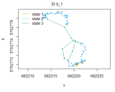
Moreover, we can plot the results: both he mix of density
distributions, as well as maps of the estimated states of the moving
animals (using the Viterbi algorithm). Using
plot(fitHMM_stepangle) will show all animals, but to show
just 1 animal (here time-series 2), we can use:
plot(fitHMM_stepangle, animals = 2)## Decoding state sequence... DONE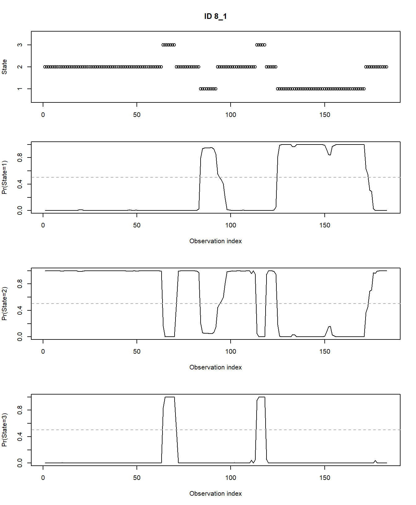
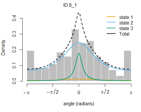
Also, we can plot the estimated probabilities that the animal is in
any of the 3 hidden states at any moment in time using
plotStates:
plotStates(fitHMM_stepangle, animals = 2)## Decoding state sequence... DONE
## Computing state probabilities... DONE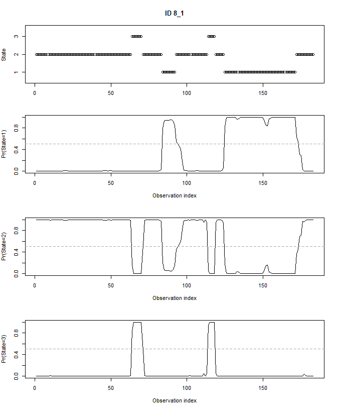
We can decode the fitted model (i.e. estimate the most likely state
at every moment in time) using the viterbi function. For
example, we can check how often the cattle were in any of the 3
estimated hidden states using:
table(viterbi(fitHMM_stepangle))##
## 1 2 3
## 103 1759 297We can also check how often a fitted hidden stated occurs per annotated behaviour:
table(behaviour = datxLabels, state = viterbi(fitHMM_stepangle))## state
## behaviour 1 2 3
## grazing 0 1576 80
## walking 1 37 202
## idle 102 146 15We see the latent state 3 is mostly associated to walking behaviour but also partly to grazing behaviour. Latent state 2 mostly to grazing (which might explain why the cattle are expected to spend most time in state 2!) and a small part to idle behaviour. State 1 is almost exclusively representing idle behaviour.
4 Challenge
Challenge
The above shows how to fit a 3-state HMM with 2 response variables.
Extend this model by including 1 or 2 extra response variables (i.e. the
accelerometer-based features that you computed yesterday), and fit the
model. Summarise and visualize the model output. For example: how do the
fitted hidden states relate to the true observed behaviours
(stored in datxLabels)? For example, a 3-state HMM with 4 response variables
(step, angle, VeDBA_sd and
yacc_sd):
fitHMM_4x <- momentuHMM::fitHMM(
  data     = preppedDat,
  nbStates = 3,
  dist     = list(step = "gamma",
                  angle = "wrpcauchy",
                  VeDBA_sd = "norm",
                  yacc_sd = "norm"),
  Par0     = list(step = c( 1,    .5,  .2,
                            1.25, .75, .25),
                  angle = c(0.6, 0.4, 0.2),
                  VeDBA_sd = c(15, 12.5, 10,
                               5, 4.5, 4),
                  yacc_sd = c(18, 16, 14,
                              8, 7, 6)))

# Explore
fitHMM_4x
## Value of the maximum log-likelihood: -15471.83
##
##
## step parameters:
## ----------------
## state 1 state 2 state 3
## mean 1.275037 0.2495804 0.11043422
## sd 1.158870 0.1415646 0.08776663
##
## angle parameters:
## -----------------
## state 1 state 2 state 3
## mean 0.0000000 0.0000000 0.0000000
## concentration 0.6217995 0.3102225 0.1899218
##
## VeDBA_sd parameters:
## --------------------
## state 1 state 2 state 3
## mean 9.817193 14.248176 1.826411
## sd 3.952680 2.920225 1.156986
##
## yacc_sd parameters:
## -------------------
## state 1 state 2 state 3
## mean 12.840553 19.55204 2.002725
## sd 6.300852 4.53290 1.365834
##
## Regression coeffs for the transition probabilities:
## ---------------------------------------------------
## 1 -> 2 1 -> 3 2 -> 1 2 -> 3 3 -> 1 3 -> 2
## (Intercept) -1.619523 -3.022689 -2.699377 -5.679369 -1.691551 -4.142988
##
## Transition probability matrix:
## ------------------------------
## state 1 state 2 state 3
## state 1 0.8021412 0.15881845 0.039040358
## state 2 0.0628091 0.93400062 0.003190278
## state 3 0.1535141 0.01322825 0.833257685
##
## Initial distribution:
## ---------------------
## state 1 state 2 state 3
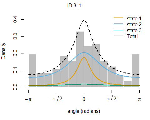
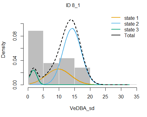
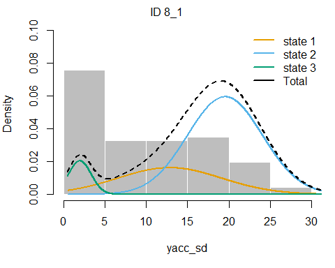
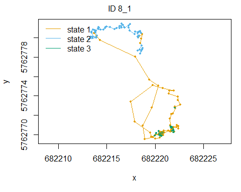
## 4.480270e-01 5.519714e-01 1.608348e-06plot(fitHMM_4x, animals = 2)## Decoding state sequence... DONE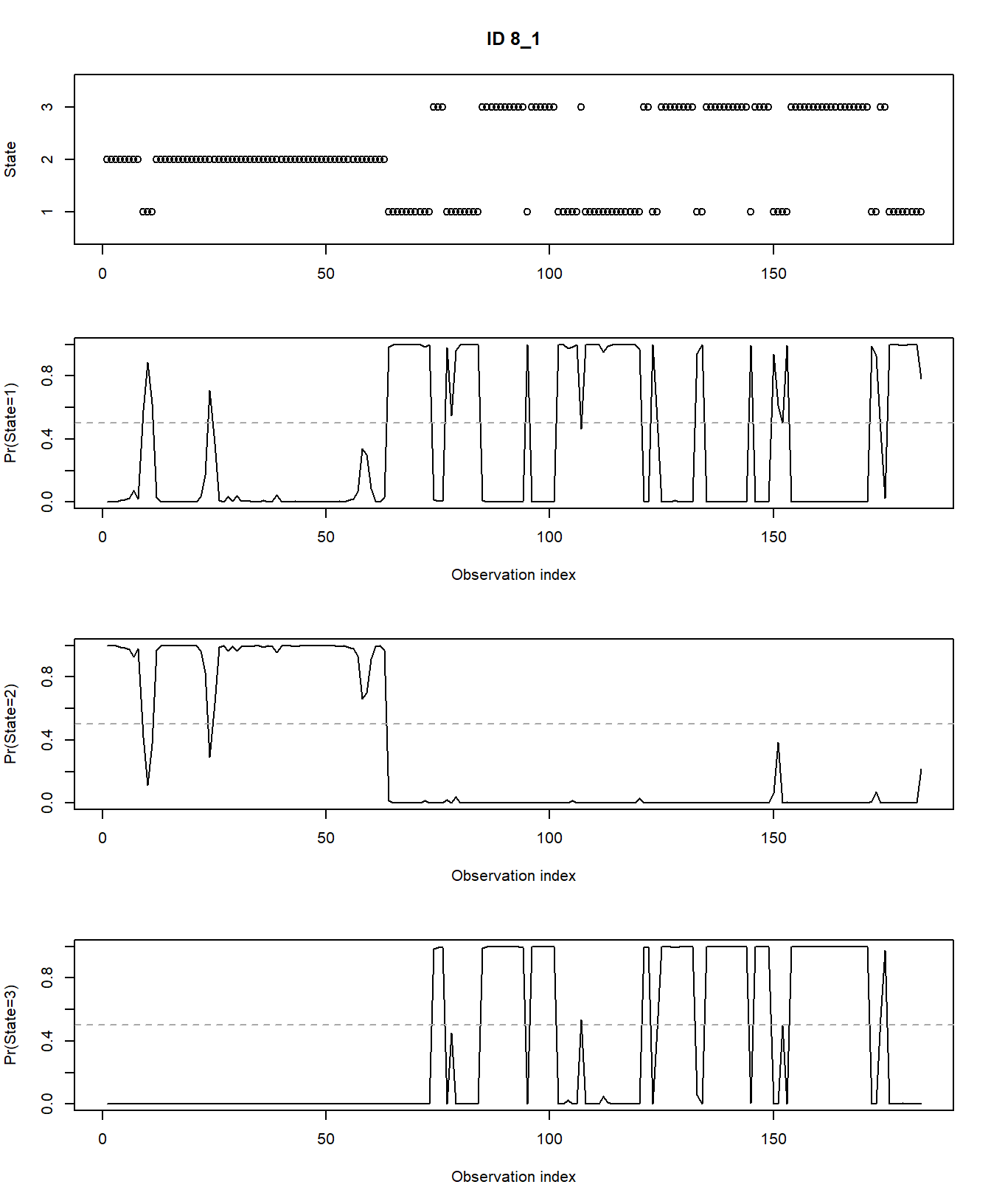
plotStates(fitHMM_4x, animals = 2)## Decoding state sequence... DONE
## Computing state probabilities... DONE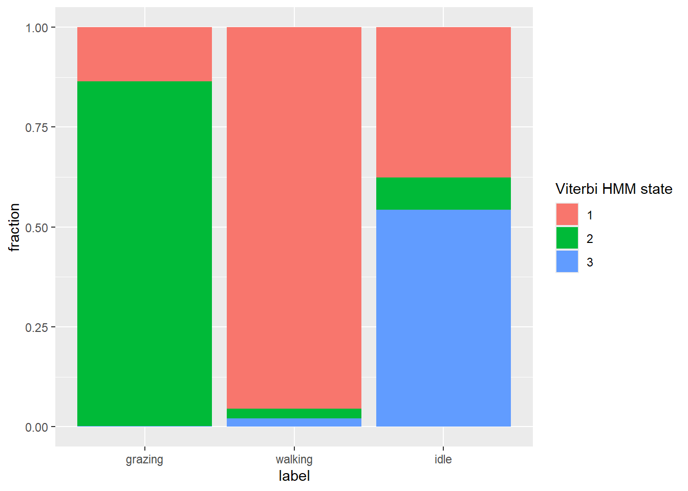
# Get fraction of viterbi HMM states per observed behaviour
dat %>%
  as_tibble() %>%
  drop_na(angle) %>%
  mutate(viterbi = as.factor(viterbi(fitHMM_4x))) %>%
  ggplot(aes(x=label, fill=viterbi)) +
  geom_bar(position="fill") +
  ylab("fraction") +
  labs(fill = "Viterbi HMM state")
We see that hidden state 1 is mostly related to walking, hidden state 2 is mostly related to grazing, and hidden state 3 is mostly related to being idle, yet also a share of state 1 occurs during idle behaviour.
5 Submit your last plot
Submit your script file as well as a plot: either your last created plot, or a plot that best captures your solution to the challenge. Submit the files on Brightspace via Assessment > Assignments > Skills day 12.
Note that your submission will not be graded or evaluated. It is used only to facilitate interaction and to get insight into progress.
6 Recap
Today, we’ve worked with time series data and fitted unsupervised algorithms. Tomorrow, we will fit supervised learning algorithms using tidymodels.
An R script of today’s exercises can be downloaded here