You can use the functions parse_date_time (see tutorial
7) and factor.
Data preparation and exploration
Overview
Today’s goal: to get used to working with time series data in a tidy manner; preparing and exploring time series data.
Resources
- timetk for R: Making time series analysis in R easier
- Vignette timetk: Visualizing Time Series
- Vignette timetk: Time Series Data Wrangling
Packages
Main functions
parse_date_time, summarise_by_time, plot_time_series, plot_acf_diagnostics
1 Introduction
The last two weeks, we worked towards, and with, tidy data: a convenient for the processing, visualisation and modelling of data. In all previous exercises, we assumed that all records in the tibble were independent: we could thus effectively shuffle the rows in the tables without impacting the subsequent visualisations and analyses done.
This week, we will work with data along a temporal dimension: time series data. The temporal dimension of such data is often in different formats, which complicates the analyses. For example1:
- time can have various resolutions (e..g years, months, days, hours, minutes, seconds, …);
- time can be associated with different time zones with possible adjustments such as daylight saving time;
- time intervals can be regular or irregular;
- time series data often includes repeated measures on multiple individuals.
In today’s tutorial, we will be working with time series data including some of the above-mentioned challenges For sake of simplicity, we will make use of regular time series, and with timestamps recorded in the same timezone and without daylight saving time (all timestamps will be in GMT). We will be using data of several cows collected via neck collars with sensors (GPS and tri-axial accelerometer) during an experiment on cow movement and behaviour in relation to pasture height in Wageningen.
Exercise 11.1a
Download the data “acc.csv” and “gps.csv” from
Brightspace > Time series analyses > Datasets >
Cattle. Save the data file in your raw data folder (for
example: data/raw/cattle/). Import the data into a tibbles
called acc and gps, respectively. Load the
“tidyverse” and “timetk” packages. Have a look at the loaded data.
library(tidyverse)
library(timetk)
gps <- read_csv("data/raw/cattle/gps.csv")
acc <- read_csv("data/raw/cattle/acc.csv")
gps
## # A tibble: 2,191 × 6
## ID burst t label x y
## <dbl> <dbl> <dbl> <chr> <dbl> <dbl>
## 1 1 1 300 idle 682170. 5762774.
## 2 1 1 303 grazing 682169. 5762773.
## 3 1 1 306 grazing 682169. 5762773.
## 4 1 1 309 grazing 682169. 5762773.
## 5 1 1 312 grazing 682169. 5762773.
## 6 1 1 315 grazing 682169. 5762773.
## 7 1 1 318 grazing 682169. 5762773.
## 8 1 1 321 grazing 682169. 5762773.
## 9 1 1 324 grazing 682169. 5762773.
## 10 1 1 327 grazing 682168. 5762773.
## # ℹ 2,181 more rowsacc## # A tibble: 209,054 × 6
## ID burst t x y z
## <dbl> <dbl> <dbl> <dbl> <dbl> <dbl>
## 1 1 1 299 490 489 628
## 2 1 1 299. 490 489 627
## 3 1 1 299. 491 488 626
## 4 1 1 299. 489 491 627
## 5 1 1 299. 488 493 632
## 6 1 1 299. 495 496 630
## 7 1 1 299. 500 493 630
## 8 1 1 299. 505 494 629
## 9 1 1 299. 516 491 627
## 10 1 1 299. 511 488 632
## # ℹ 209,044 more rowsBoth tibbles contain the columns ID, burst
and t:
IDis the cow identifier;burstis an identifier nested withinIDfor burst: a consecutive uninterrupted stretch of data;tis the timestamp, measured in seconds from 09:00 21/4/2018 GMT.
Tibble gps contains 3 more columns:
labela character vector with the annotated behaviour of the cow at any moment in time (annotated through visual observation in the field), with the behaviours grazing, walking and idle. The original data includes more behavioural classes, but these labels were reclassified to these three broad classes.xandyare the spatial coordinates, in units meters in the projected coordinate system UTM31N.
Tibble acc also contains 3 more columns:
x,y,zare the acceleration forces (not gravity corrected) in 3 dimensions.
The accelerometer data were sampled at 32 Hz.
2 Prepare data
Exercise 11.2a
For gps: use column t and the information
given above to compute a new feature called dttm that is an
R datetime object. Also, convert the column label to a
factor with the levels “grazing”,“walking” and “idle”. # save the reference time to object t0, which can be used here as well as below
t0 <- parse_date_time("2018-04-21 09:00:00",
orders = "%Y-%m-%d %H:%M:%S",
tz = "GMT")
# mutate data in gps object
gps <- gps %>%
mutate(dttm = t0 + t,
label = factor(label,
levels = c("grazing","walking","idle")))
Exercise 11.2b
For acc: use column t and the information
given above to compute a new feature called dttm that is an
R datetime object, similar to how you did it in the previous exercise.
acc <- acc %>%
  mutate(dttm = t0 + t)
Exercise 11.2c
Explore the data, e.g. by plotting the x, y
and z values in 1 plot against time for the first animal
(ID == 1) and the first hour of data
(t < 600). acc %>%
filter(ID == 1, t < 600) %>%
ggplot(aes(x=dttm)) +
geom_line(aes(y=x), col="red") +
geom_line(aes(y=y), col="green") +
geom_line(aes(y=z), col="blue") +
xlab("time") +
ylab("accelerometer value")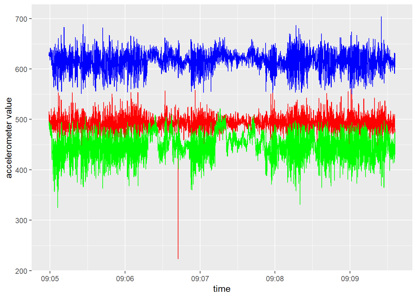
As can be seen in the plot of the previous exercise, data (e.g. accelerometer data) can often contain outliers. It may therefore often be wise to check for outliers, and to replace extreme values. For example, we could use an outlier removal algorithm, or do it ourselves by replacing values that are higher then (lower than) some threshold value, e.g. the 0.1% quantile (or 99.9% quantile). The code below computes (per accelerometer axis) first the 0.1% and 99.9% quantile values, than replaces values respectively lower or higher than these quantiles with these quantiles, and finally removes the computed columns with these quantiles:
acc <- acc %>%
  mutate(minx = quantile(x, probs=0.001),
         maxx = quantile(x, probs=0.999),
         x = pmax(x, minx),
         x = pmin(x, maxx),

         miny = quantile(y, probs=0.001),
         maxy = quantile(y, probs=0.999),
         y = pmax(y, miny),
         y = pmin(y, maxy),

         minz = quantile(z, probs=0.001),
         maxz = quantile(z, probs=0.999),
         z = pmax(z, minz),
         z = pmin(z, maxz)) %>%

  select(-starts_with("min")) %>%
  select(-starts_with("max"))
In the code above, we use the pmax function to return
the parallel maxima and minima of the input values in order to
truncate the signals to their 0.1 - 99.9% range, using the
quantile function that produces sample quantiles
corresponding to the given probabilities.
Besides using ggplot2, time series data is often conveniently plotted by an dynamic plotting library such as dygraphs or plotly.
For example, we could use dygraphs to plot the x, y and z axes of the accelerometer as function of time (here via a xts time series object, but we could also plot it from a data.frame or tibble), like done above statically using ggplot:
# Load libraries
library(dygraphs)
library(xts)
# Get data (here 1 hr for the first animal)
plotData <- acc %>%
  filter(ID == 1, t < 600) %>%
  select(dttm, x:z)
# convert data to xts timeseries
series <- xts(plotData %>% select(-dttm),
              order.by = plotData$dttm,
              tzone = "GMT", check = FALSE)
dygraph(series, main = "Accelerometer values") %>%
  # Add range selector at the bottom of polot
  dyRangeSelector() %>%
  # Set options useDataTimezone to TRUE, so that
  # plot uses data timezone and not local (PC) timezone
  dyOptions(useDataTimezone = TRUE)
Here, we add a range selector to the bottom of the chart that
allows us to pan and zoom to various time ranges (we can also select a
range in the main plot, and zoom out to the full temporal range by
double clicking).
As the acc data (x, y and
z) are not gravity-corrected, it may be good to first
center the data (i.e. subtract the mean) and then collapse the 3
dimensions into a single dimension by calculating the vectorial sum of
the dynamic body acceleration (\(VeDBA\)):
\[VeDBA = \sqrt{x^2+y^2+z^2}\]
Exercise 11.2d
For the acc data: first center the x,
y and z columns, and then calculate \(VeDBA\) as a new column VeDBA.
Then, rename the columns x, y and
z to xacc, yacc and
zacc, respectively, so as to avoid confusion later on with
x and y columns from dataset gps
To center: remove the mean from the vector of data. To compute the
square root, use the function sqrt.
acc <- acc %>%
  mutate(
    # Center the xyz dimension
    x = x - mean(x, na.rm=TRUE),
    y = y - mean(y, na.rm=TRUE),
    z = z - mean(z, na.rm=TRUE),
    # compute VeDBA
    VeDBA = sqrt(x^2+y^2+z^2)) %>%
  rename(xacc = x,
         yacc = y,
         zacc = z)
3 Summarise data
Because the gps and acc data are recorded
at different temporal resolutions (respectively at \(\frac{1}{3}\)Hz and 32Hz), we first have to
align both time series. We are going to do that by computing summary
statistics of the high-resolution time series (acc) at the
resolution of the low-resolution time series (gps). Thus,
we are going to compute several single-value summary statistics of the
32Hz signal for every step of 3 seconds.
Exercise 11.3a
Compute multiple summary statistics for each individual and each burst,
for each 3-second period; thus, based on the ID and
dttm columns in the acc dataset. summarize the
values in the columns xacc, yacc,
zacc, and VeDBA, where you need to compute
both the mean and the standard deviation. Give short but meaningful
names to the newly created summary features, for example by adding a
suffix _sd or _mean to the original feature
name (e.g. the standard deviation of xacc could become
xacc_sd). To summarize data per window of specified duration, you can use the
summarise_by_time function of the timetk
package: the size of the window can be specified with the
.by argument, whereas the way timestamps are rounded can be
specified by the .type argument (e.g. “floor”, “ceiling” or
“round”; here use “floor”).
Window sizes can be specified in different ways, e.g. using character
a string with the units (options: second,
minute, hour, day,
week, month, bimonth,
quarter, season, halfyear and
year) optionally with a multiple of it (e.g. “2 hours”).
Or, it can be specified according to the period function
from package lubridate.
Note that for grouped data (here per “ID” and “burst”
combination), you can combine summarise_by_time with the
group_by function from the dplyr package in a single
pipeline!
# Summarize acc data per 3 seconds
acc <- acc %>%
    group_by(ID, burst) %>%
    summarise_by_time(dttm, # time column
                      .by = "3 seconds", # winddow size
                      xacc_mean = mean(xacc),
                      xacc_sd = sd(xacc),
                      yacc_mean = mean(yacc),
                      yacc_sd = sd(yacc),
                      zacc_mean = mean(zacc),
                      zacc_sd = sd(zacc),
                      VeDBA_mean = mean(VeDBA),
                      VeDBA_sd = sd(VeDBA),
                      .type = "floor") # used to round the timestamps

# inspect
acc
## # A tibble: 2,201 × 11
## # Groups: ID, burst [16]
## ID burst dttm xacc_mean xacc_sd yacc_mean yacc_sd zacc_mean zacc_sd VeDBA_mean VeDBA_sd
## <dbl> <dbl> <dttm> <dbl> <dbl> <dbl> <dbl> <dbl> <dbl> <dbl> <dbl>
## 1 1 1 2018-04-21 09:04:57 -0.173 6.67 22.9 5.24 9.19 3.82 25.8 5.42
## 2 1 1 2018-04-21 09:05:00 -2.47 9.98 -11.8 26.3 -4.26 18.6 30.8 18.6
## 3 1 1 2018-04-21 09:05:03 -6.06 13.5 -34.7 21.9 -13.0 19.8 46.2 17.8
## 4 1 1 2018-04-21 09:05:06 -1.91 18.8 -30.4 27.7 -7.80 22.5 46.9 20.2
## 5 1 1 2018-04-21 09:05:09 -7.59 14.7 -23.5 25.3 -3.15 21.5 40.5 16.9
## 6 1 1 2018-04-21 09:05:12 -8.88 13.3 -18.8 12.6 -4.31 11.8 28.5 10.5
## 7 1 1 2018-04-21 09:05:15 -1.75 22.4 -19.6 23.6 -5.09 21.1 40.3 16.7
## 8 1 1 2018-04-21 09:05:18 -4.60 16.8 -23.2 22.8 -1.83 15.0 35.8 17.5
## 9 1 1 2018-04-21 09:05:21 -6.55 15.1 -15.2 21.4 -2.14 16.2 30.8 16.6
## 10 1 1 2018-04-21 09:05:24 -6.04 16.6 -27.0 28.1 -9.91 24.3 45.6 20.6
## # ℹ 2,191 more rowsNow, the ACC data is a grouped tibble (with ID and burst as the grouping identifiers; 16 groups in total) with summary statistics every 3 seconds!
Now that we’ve made sure that both time series have the same resolution (the GPS data was already at 3 second intervals, the ACC data now is summarized to every 3 seconds), we can move on to join these aligned datasets.
In this particular case, the GPS data was already at 3-second
recolution, measured at the same time at which the ACC data was
summarised: every 3 seconds from the start of a minute (thus at :00,
:03, :06, …, :57). However, this is not always the case. In such a case,
you could opt for orunding down the timestamps in the GPS data,
e.g. using floor_date(dttm, unit = "3 seconds"):
gps <- gps %>%
  mutate(dttm = floor_date(dttm, unit = "3 seconds"))
Let’s use the tools that we learned about in tutorial 10 to join the data.
Exercise 11.3b
Join the data of acc to the data of gps, and
assign the result to an object called dat Consider the use of left_join to join the data in
acc to that in gps, by columns
ID, burst and dttm.
dat <- gps %>%
  left_join(acc, by = c("ID", "burst", "dttm"))
Exercise 11.3c
Since time-series analyses are often impacted by the sequence
of the data, it is often wise to force the data to be
chronological: in the worst case this step is redundant since
the data is already chronological, yet in many other cases it will
prevent problems in data analysis that result from the data being not
chronological. Thus, make the data chronological within each
individual animal and burst. To make the data chronological, group the data per ID
and burst and arrange on column dttm.
dat <- dat %>%
  group_by(ID, burst) %>%
  arrange(dttm)
Exercise 11.3d
Use the data from the previous exercise (object dat) to
calculate the step length, step, and turning angle,
angle (from the columns x and y
from the GPS sensor). Step distances can be computed using Pythagoras’ theorem: \(distance = \sqrt{dx^2+dy^2}\), where \(dx\) and \(dy\) are the displacements in the \(x\) and \(y\) directions, respectively.
To compute these displacements (differences in coordinate between
subsequent positions) there are a few options. One option would be to
use the base R function diff, but since this function
returns \(n-1\) differences for a
vector with \(n\) records, we will have
to pad the differences with a NA value either at
the start or at the end of the resultant vector. Alternatively, a better
option may be to use the lag or lead functions
to find, respectively, the “previous” or “next” values in a vector
(thus, in that case dx = lead(x) - x returns the distance
of the current point to the next point along the
x-axis direction).
The sqrt function can be used to compute the square root
needed in Pythagoras’ theorem, and to raise some value to some power we
can use the notation ^, e.g. 3^2 means the
value 3 raised to the power 2.
To compute turning angles, first calculate movement headings,
head, which can be calculated from dx and
dy using the atan2(dx,dy) function. Then, from
the headings calculate the turning angles (angle) between
subsequent headings using the function tangle that is shown
in Appendix C (thus load it in memory before using it, or source it in
your script using
source("https://wec.wur.nl/dse/-scripts/tangle.r")).
Calculate the step and angle for each time
series, thus group by ID and burst!
# source turning angle function (tangle)
source("https://wec.wur.nl/dse/-scripts/tangle.r")

# compute movement metrics
dat <- dat %>%
  group_by(ID, burst) %>%
  mutate(dx = lead(x) - x,
         dy = lead(y) - y,
         step = sqrt(dx^2 + dy^2),
         head = atan2(dx, dy),
         angle = tangle(head))
4 Exploration and autocorrelation
Exercise 11.4a
Explore the data by plotting it: plot the computed features, e.g. “step” or “VeDBA_mean” for individual 1.
Also explore the autocorrelation structure in these computed features, but make sure to ungroup the data before doing this.To visualize timeseries data, the function
plot_time_series from package timetk is very
helpful. This function also allows combination with dplyr’s
group_by function in a single pipeline. To explore temporal
autocorrelation structure in timeseries data, the function
plot_acf_diagnostics (also from package timetk) is
very helpful, and also this function allows combining it with
group_by and %>%.
In these functions, you pass the column name holding the timestamps
to argument .date_var, and the column name holding the
values to plot to argument .value. Many functions of the
timetk package that produce plots also have an argument
.interactive, where you can specify whether or not you want
to have a dynamic plot (via plotly) instead of a static ggplot.
The plot_time_series function by default adds a smooth
trendline, yet this can be removed by setting
.smooth = FALSE.
# Explore the data by plotting
dat %>%
    filter(ID == 1) %>%
    plot_time_series(
      .date_var = dttm,
      .value = step, # or VeDBA_mean
      .interactive = TRUE,
      .facet_scales = "free_x",
      .smooth = FALSE)
# Plot (partial) autocorrelation function
dat %>%
ungroup() %>%
plot_acf_diagnostics(
.date_var = dttm,
.value = step, # or VeDBA_mean
.lags = 0:20, # max till 20*3minutes = 1 hour
.interactive = TRUE)We see that for the computed movement step size, the level of auto-correlation at lag 1 (thus: GPS positions 3 seconds apart!) is quite high (ca 0.83). Thus, when the tracked cattle are walking fast (i.e. large step size in 3 seconds), it also is likely to walk fast the next timestep (of 3 seconds). However, the correlation is dropping quite quickly, so indicating that they do not maintain a similar movement speed for very long periods. Possibly these cattle are walking a few seconds, then spend some time grazing, after which they walk again a few steps, etc.
5 Challenge
Challenge
Explore the data stored in dat, for example by showing the
patterns in the different features as function of the behavioural class
as indicated in label. Try to make some nice-looking
informative graphs. For example, you can try to plot some
autocorrelation measure for the different behaviours (the
autocorrelation function acf can be handy here, or perhaps
better, the partial autocorrelation function pacf).
dat %>%
  ggplot() +
  geom_boxplot(aes(x = label, y = step)) +
  scale_y_sqrt()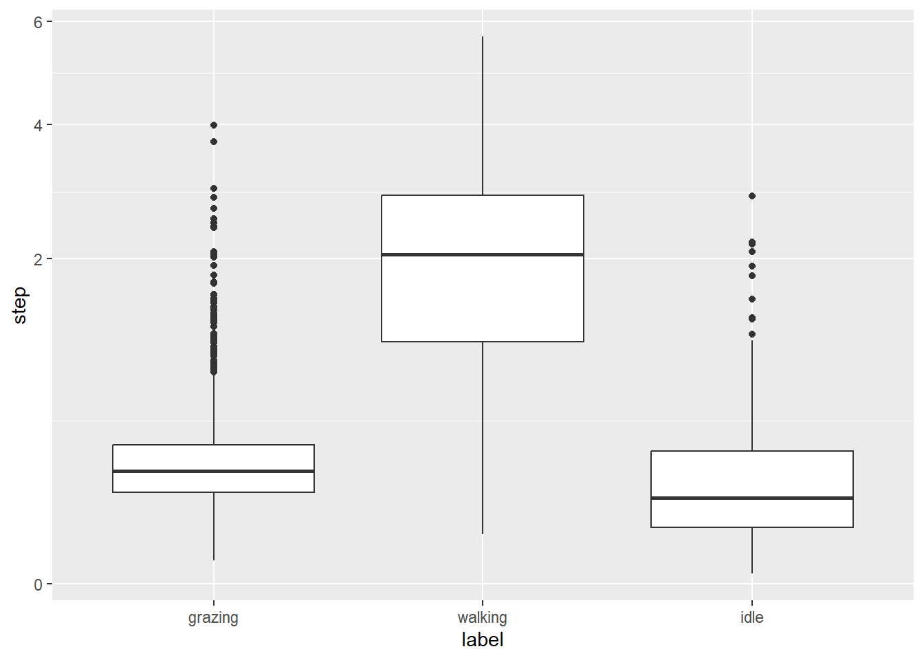
dat %>%
  ggplot() +
  geom_boxplot(aes(x = label, y = angle)) +
  scale_y_sqrt()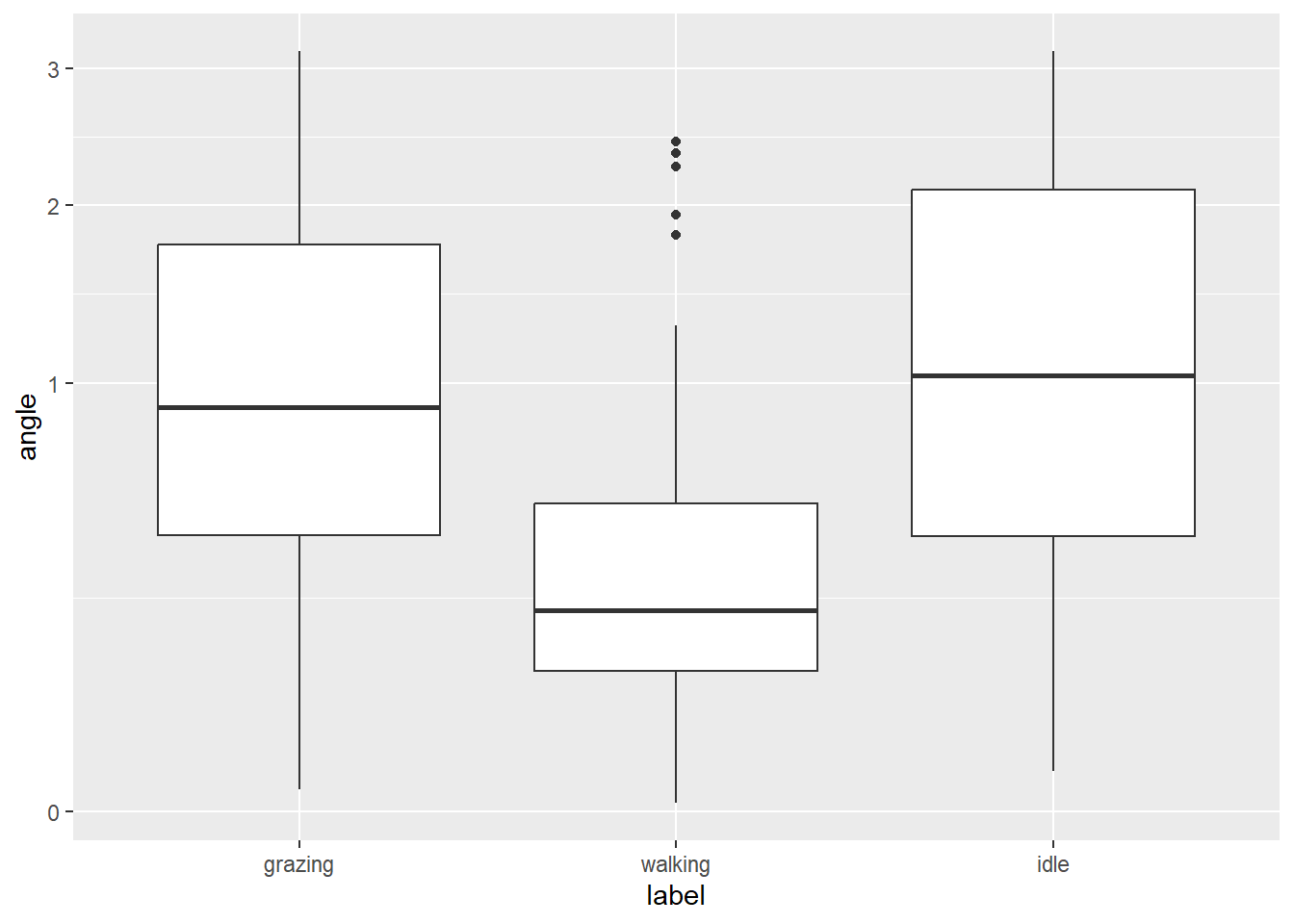
dat %>%
  ggplot() +
  geom_boxplot(aes(x = label, y = VeDBA_sd)) +
  scale_y_sqrt()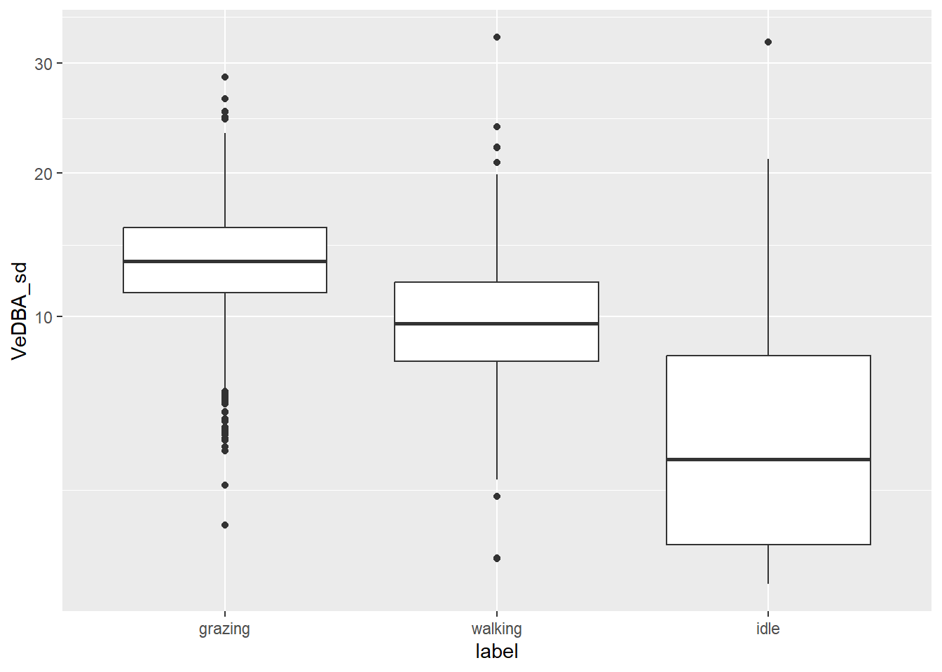
dat %>%
  ggplot() +
  geom_boxplot(aes(x = label, y = yacc_sd)) +
  scale_y_sqrt()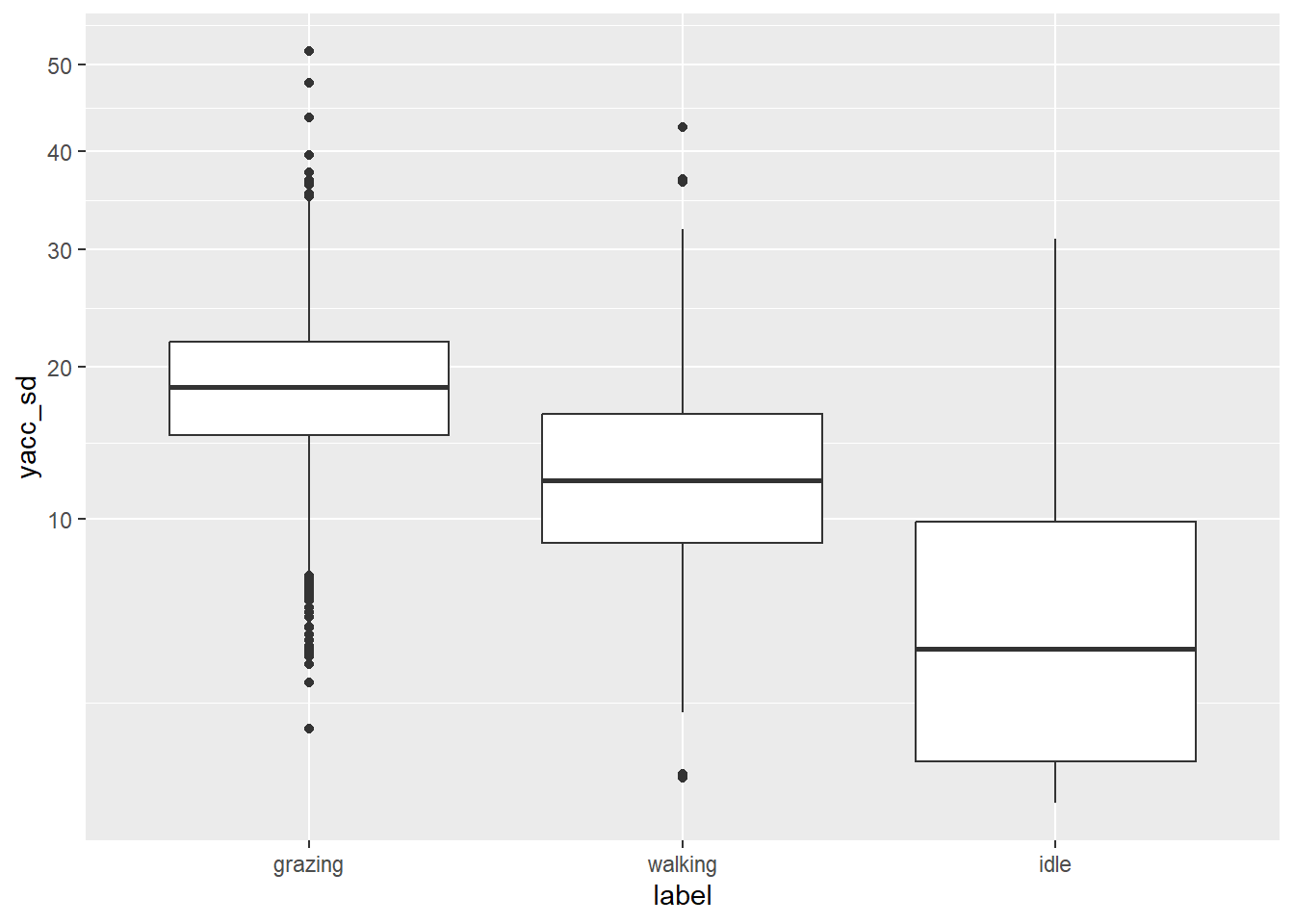
dat %>%
  as_tibble() %>%
  group_by(ID,burst,label) %>%
  summarise(acf = acf(na.omit(step), lag.max = 1, plot = FALSE)$acf[2]) %>%
  ungroup() %>%
  ggplot() +
  geom_boxplot(aes(x = label, y = acf)) +
  scale_y_sqrt()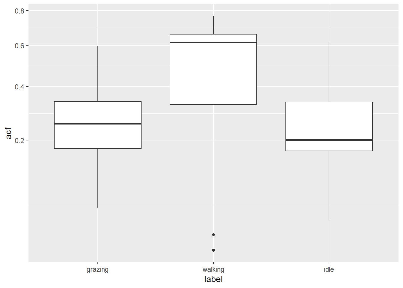
6 Submit your last plot
Submit your script file as well as a plot: either your last created plot, or a plot that best captures your solution to the challenge. Submit the files on Brightspace via Assessment > Assignments > Skills day 11.
Note that your submission will not be graded or evaluated. It is used only to facilitate interaction and to get insight into progress.
7 Recap
Today, we’ve explored the timetk package to work with time series data, and prepared the data for analyses. Tomorrow, we will use this prepared data with unsupervised learning algorithms.
An R script of today’s exercises can be downloaded here