Use the select function in combination with dataset
deer and the pipe operator %>%. Note that
with just 1 function call, you do not actually need the pipe, unless you
plan to extend it with more functions.
Data wrangling with the pipe
Overview
Today’s goal: to learn to use the pipe operator
%>% from the magrittr package to make the
process of data manipulation easier and more intuitive.
Resources
Packages
Main functions
pipe %>% as well as the main dplyr verbs covered yesterday: select, filter, arrange, mutate, summarise, group_by
Cheat sheets
1 Combining transformations
In yesterday’s lecture and tutorial, we saw the main verbs
that the package dplyr provides: filter,
select, arrange, mutate,
summarise and group_by. Moreover, you saw a
few helper functions, such as n, desc,
rename and starts_with. In some of yesterday’s
exercises, you were asked to do not only a single transformation, but
multiple. When you want to do multiple transformations, there are a few
ways to do this. You can either save each intermediate step as a new
object (from a tibble named dat to dat1 to
dat2 to dat3 etc.), or overwrite the original
object many times. Both these options are not ideal! Namely, when saving
the object after each transformation to an object with different name,
we have to think about the name of the object we are going to assign the
result to. As above, we can easily use dat1,
dat2 and dat3, but what do these names mean
actually? Moreover, we are in fact cluttering the computer’s memory as
well as the objects in our workspace/environment. If we use the latter
option, thus we are going to overwrite the original object
dat with the result of a transformation, we have to be very
careful because if we make a mistake we have to re-run the entire script
to get the original object back. Thus, this complicates debugging!
Alternatively, we can conduct multiple transformations at once by
nesting functions inside of each other. To illustrate these different
options, let’s pretend that we want to compute the exponent of the
cosine of the sine of a value x. Suppose that
x has the value 2.
Using the first option, we can save intermediate objects a few times and in doing so get to our final result :
x <- 2
x1 <- sin(x)
x2 <- cos(x1)
x3 <- exp(x2)
x3
## [1] 1.848363In a few lines of code, we have the answer to our problem. This gets
messy quite quickly, clutters the workspace, and is a big source of
mistakes. There is no point in saving intermediate steps unless we are
really interested in them. Hence, we could overwrite object
x a few times and do the same:
x <- 2
x <- sin(x)
x <- cos(x)
x <- exp(x)
x
## [1] 1.848363The advantage above this option is that we now have only 1 object in
memory, x, but still a lot of code. Also, the
x where we started from is now lost from memory. Thus, this
is also not ideal.
The other option is to chain multiple commands together by nesting functions inside each other. Let’s do that for this simple exercise:
x <- 2
exp(cos(sin(x)))
## [1] 1.848363This is handy, but can be difficult to read if too many functions are
nested, as R evaluates the expression from the inside out (in this case,
first sin, then cos, then exp).
Hence, nesting functions inside each other will make your code look less
clear and less structured, so that the risk of errors increases
massively. This is especially true with longer function names, and when
functions have multiple arguments.
2 The pipe
The tidyverse package, actually the magrittr package
that introduced it, offers a very convenient solution: the
pipe operator %>%. The pipe puts the
actions – the verbs – into a single logical and intuitive
sequence. Do this, then this, and then this. The pipe
operator %>% is thus best pronounced as
then! Pipes thus let you take the output of one
function and send it directly to the next, which is useful when you need
to do many things to the same dataset.
Let’s demonstrate the use of the pipe with the test example as above,
assigning the value of the set of transformations to an object called
y:
x <- 2
y <- x %>%
  sin() %>%
  cos() %>%
  exp()
y
## [1] 1.848363In this way, we can use the pipe to chain multiple functions together in a single statement, without needing variables to store the intermediate results! This greatly helps us in writing clear and readable code. Indeed, the creator of the magrittr package created the pipe operator to improve readability and maintainability of code, and thereby to greatly simplify our life!
Does the pipe operator %>%remind you of something?
Recall that ggplot also uses some kind of pipe
operator: +. In fact: the predecessor of the ggplot2
package, ggplot, is actually much older than the tidyverse/magrittr
packages: would the programmers of the ggplot2 package have coded their
package right now, they would have used the pipe operator
%>%!
The use of the pipe operator %>% thus has the
following advantages:
- the sequence of data operations is structured from left to right, as opposed to from inside and out;
- nested function calls are avoided;
- we’ll minimize the need for storing local variables and function definitions. Thus, we’ll emphasise a sequence of actions, rather than the objects that the actions are being performed on;
- we’ll make it easy to add steps anywhere in the sequence of operations.
In these tutorials, we are using magrittr’s pipe
operator (%>%) instead of the new base R pipe operator
(|>). Note that their usage remains quite similar for
basic operations, and both can greatly enhance the readability and
efficiency of your R code. However, the %>% pipe
operator offers more flexibility for more advanced operations (e.g. with
placeholders and advanced error handling). Hence, we advice to use
%>% in your code. Read more
here.
3 Do’s and don’ts
The tidyverse style guide lists a few do’s and don’ts when working with pipes:
Don’t use the pipe when:
- You need to manipulate more than one object at a time. Reserve pipes for a sequence of steps applied to one primary object.
- There are meaningful intermediate objects that should be stored in memory and that could be given informative names.
However, when you do:
- always have a space before it, and should usually be followed by a new line (enter). After the first step, each line should be indented (this is automatically done by RStudio; by default RStudio indents with 2 spaces, but this can be adjusted in the settings). This structure makes it easier to add new steps (or rearrange existing steps) and harder to overlook a step;
- if the arguments to a function don’t all fit on one line, put each argument on its own line and indent (also automatically done in RStudio): this improves readability of the code;
- a one-step pipe can stay on one line, but unless you plan to expand it later on, you should consider rewriting it to a regular function call;
- you could omit
()on functions that don’t have arguments (such as the functionssin,cos,expused above), yet it is best to avoid this and thus even then include()after the function name.
Although the most-used assignment operator is <- in
R, you can actually assign from left to right as well using
->! The assignment operator -> can for
example be used for assigning the result of a pipe. Thus, the following
two notations can be used, where the use of the assignment operator
-> may actually make intuitively more sense when using a
pipe than the standard assignment operator <-. Check for
yourself:
x <- 2
y <- x %>%
  sin() %>%
  cos() %>%
  exp()
vs.
x <- 2
x %>%
  sin() %>%
  cos() %>%
  exp() -> y
As with any infix operator (such as +, *,
^, &, %in%), you can find the
official documentation if you put it in quotes: ?'%>%'
or help('%>%'). You do not have to type the pipe
operator always by hand: you can also use a hot key in RStudio:
Ctrl + Shift + M on Windows and Linux, or
Cmd + Shift + M on Mac.
4 Hoge Veluwe camtrap data
In this tutorial, We’ll use the same tidy datasets as for Tutorial 2 - Data wrangling using dplyr
| File | Description |
|---|---|
| NPHV_observations_joined.csv | All 27373 observations with joined data |
| NPHV_deer_month_station.csv | The counts of Red deer by month and station |
Exercise 4.4a
Create a new script, load the tidyverse package, set the working
directory, and load the file “NPHV_observations_joined.csv” into a
tibble called obs and “NPHV_deer_month.csv” into an tibble
called deer. library(tidyverse)
obs <- read_csv("data/raw/nphv/NPHV_observations_joined.csv")
deer <- read_csv("data/raw/nphv/NPHV_deer_month.csv")5 Applying the pipe
Exercise 4.5a
Repeat exercise 3.7a from yesterday’s tutorial, but now using the pipe
operator %>%. Thus, select the columns “Jan”, “Feb”,
“Mar” and “Jun” from deer. deer %>%
select(Jan:Mar, Jun)## # A tibble: 48 × 4
## Jan Feb Mar Jun
## <dbl> <dbl> <dbl> <dbl>
## 1 0 0 7 0
## 2 0 0 0 0
## 3 0 4 0 0
## 4 0 1 0 0
## 5 2 0 10 11
## 6 0 1 12 46
## 7 0 1 5 0
## 8 0 11 0 0
## 9 0 0 0 0
## 10 5 1 0 5
## # ℹ 38 more rowsNote that this is equivalent to:
select(deer, Jan:Mar, Jun)
Exercise 4.5b
Repeat the challenge from yesterday’s tutorial, but now use pipes to skip the intermediate steps. First focus only on getting the output as a tibble, and then extend the pipe to produce the horizontal bar chart with species ranked by their number of observations.
Thus: using the obs dataset:
- subset the data to keep only data from mammal species: to filter the data where the column “Class” has the value “Mammals”;
- for each species, count the number of record: do this by using the
functions
group_byandsummarisein an appropriate way; - then arrange the data on descending number of records
- and lastly filter the data to keep only species with 100 or more records;
- chain these operations together via the pipe operator
%>%.
If you do not directly plot the output, then you should be getting this output:
## # A tibble: 7 × 2
##   Species                   n
##   <chr>                 <int>
## 1 Cervus elaphus        12020
## 2 Ovis ammon musimon     3661
## 3 Sus scrofa             2947
## 4 Capreolus capreolus    2733
## 5 Oryctolagus cuniculus   244
## 6 Lepus europaeus         155
## 7 Vulpes vulpes 119filter, group_by,
summarise and arrange functions in a single
pipeline using the pipe operator %>%. If you do not get
the same output, revise your code, and ask for help if needed. obs %>%
filter(Class == "Mammals") %>%
group_by(Species) %>%
summarise(n = n()) %>%
arrange(desc(n)) %>%
filter(n >= 100)## # A tibble: 7 × 2
## Species n
## <chr> <int>
## 1 Cervus elaphus 12020
## 2 Ovis ammon musimon 3661
## 3 Sus scrofa 2947
## 4 Capreolus capreolus 2733
## 5 Oryctolagus cuniculus 244
## 6 Lepus europaeus 155
## 7 Vulpes vulpes 119and with barplot:
obs %>%
  filter(Class == "Mammals") %>%
  group_by(Species) %>%
  summarise(n = n()) %>%
  arrange(desc(n)) %>%
filter(n >= 100) %>%
ggplot(mapping = aes(x = reorder(Species, n), y = n, fill = n)) +
geom_col() +
coord_flip() +
ggtitle("Species rank") +
labs(x = "Species") +
scale_y_sqrt()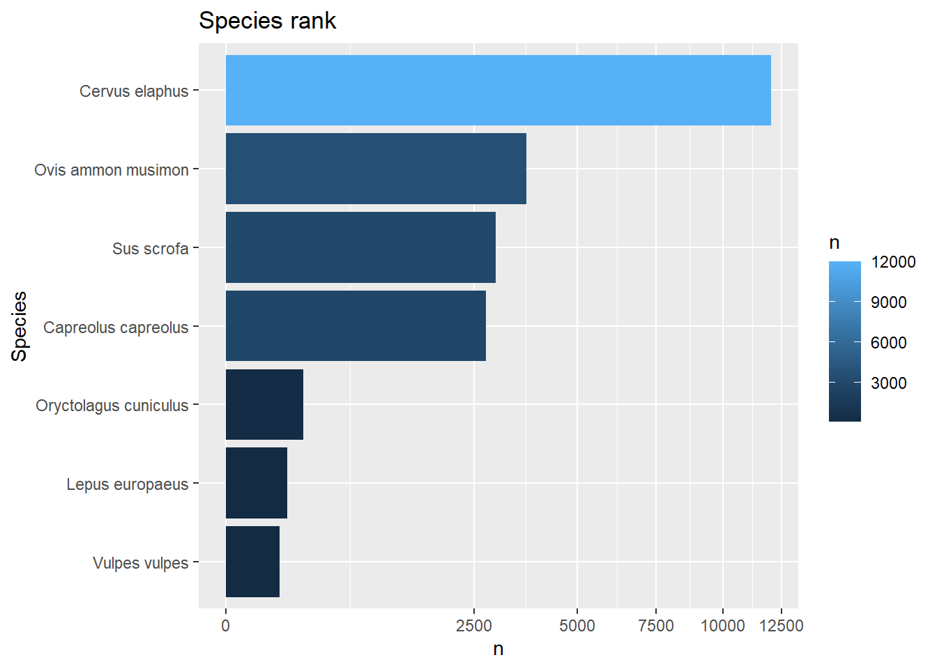
6 Ungrouping
In several exercises, the group_by function is used. The
result returned by this function is a grouped data.frame/tibble, in
which the grouping columns are kept track of (for details see
here).
Sometimes the grouping is only an intermediate step in the
transformation pipeline. For example, it may be that we want to compute
new features per group (using the mutate function), and
after this step of feature engineering remove the grouping information.
Removing grouping information can be done in different ways. First,
there is the general ungroup function which removes any
grouping information in a tibble. Also, when grouping data and then
summarizing it (using the summarize function), we can use
the (at this stage still experimental) function argument
.groups; see the helpfile of ?summarize. When
setting .groups = "drop", the grouping information is
dropped from the result, yet when setting .groups = "keep"
all grouping information is kept. In many situations, the
summarize function will, by default, drop the last grouping
key (.groups = "drop_last"), having consequences for
subsequent analyses.
Exercise 4.6a
Use the deer dataset to first compute the capture rate (a
new column called rate which is Total divided
by Effort_d), then group by columns Restricted
and Habitat (in that order), and summarise the data by
computing the mean rate. Put all statements in a single
operation via the pipe, and assign the output to an object called
deersum. Inspect the object deersum by
printing it to the console, and check the grouping of
deersum using the functions group_vars and
groups. Is deersum a grouped tibble, and if
so, which column specifies the grouping levels? deersum = deer %>%
mutate(rate = Total / Effort_d) %>%
group_by(Restricted, Habitat) %>%
summarise(rate = mean(rate))
deersum## # A tibble: 12 × 3
## # Groups: Restricted [2]
## Restricted Habitat rate
## <dbl> <chr> <dbl>
## 1 0 Driftsand 0.0681
## 2 0 Dry Heathland 0.777
## 3 0 Forest Culture 0.382
## 4 0 Pasture 3.17
## 5 0 Pine Forest 0.419
## 6 0 Wet Heathland 0.0970
## 7 1 Driftsand 0.287
## 8 1 Dry Heathland 0.627
## 9 1 Forest Culture 0.837
## 10 1 Pasture 8.24
## 11 1 Pine Forest 1.13
## 12 1 Wet Heathland 0.480group_vars(deersum)## [1] "Restricted"groups(deersum)## [[1]]
## RestrictedThe “Restricted” column now specifies the grouping levels of this
grouped tibble. Namely, the default is .groups="drop_last",
so that the last grouping column (here: Habitat) is
dropped, thus keeping only Restricted as grouping
column.
Exercise 4.6b
Update the code of the previous exercise in such a way that all grouping
information is dropped. Use the input argument .groups of the
summarize function, or include an explicit
ungroup() statement in the pipe.
This can be done using the .groups argument of
summarize:
deersum = deer %>%
  mutate(rate = Total / Effort_d) %>%
  group_by(Restricted, Habitat) %>%
  summarise(rate = mean(rate), .groups = "drop")
group_vars(deersum)
## character(0)groups(deersum)## list()Or, by using the ungroup() function in the pipe:
deersum = deer %>%
  mutate(rate = Total / Effort_d) %>%
  group_by(Restricted, Habitat) %>%
  summarise(rate = mean(rate)) %>%
  ungroup()
group_vars(deersum)
## character(0)groups(deersum)## list()In both cases, there is no grouping information kept in the output
deersum: the groups function returns an empty
list, whereas the group_vars function returns a character
vector of length 0 (thus also empty!).
As you can see above, grouping information can be kept after a
summarize function call, dropped, or (as per default) kept
except for the last grouping variable. Sometimes, this is not desired,
and thus it may be good to ungroup the data.frame (that is to remove the
grouping information), using the ungroup function, after
using group_by and summarise functions.
Forgetting to ungroup the dataset won’t affect some further processing,
but can really mess up other things.
Exercise 4.6c
Calculate the difference between the average capture rate in restricted
habitat and unrestricted habitat, for each habitat type. Thus, first
compute the capture rate using the mutate function (compute
a new column called rate), then group by the columns
“Restricted” and “Habitat” (in that order, here for the purpose of
training), then summarize the data by computing the mean capture rate,
and then summarize the result again by computing the difference between
restricted and unrestricted habitat. When grouping by the columns “Restricted” and “Habitat” in that
order, you will have to make sure that your last summary statistic is
grouped in the correct way. To compute differences, the
diff function comes in handy!
deer %>%
  mutate(rate = Total / Effort_d) %>%
  group_by(Restricted, Habitat) %>%
  summarise(rate = mean(rate), .groups="drop") %>%
  group_by(Habitat) %>%
  summarize(diffrate = diff(rate))
## # A tibble: 6 × 2
## Habitat diffrate
## <chr> <dbl>
## 1 Driftsand 0.219
## 2 Dry Heathland -0.150
## 3 Forest Culture 0.455
## 4 Pasture 5.07
## 5 Pine Forest 0.710
## 6 Wet Heathland 0.383Thus, except for habitat “Dry Heathland”, the capture rate in the restricted habitat is higher than in the unrestricted habitat. The same can be achieved via:
deer %>%
  mutate(rate = Total / Effort_d) %>%
  group_by(Restricted, Habitat) %>%
  summarise(rate = mean(rate)) %>%
  ungroup() %>%
  group_by(Habitat) %>%
  summarize(diffrate = diff(rate))
## # A tibble: 6 × 2
## Habitat diffrate
## <chr> <dbl>
## 1 Driftsand 0.219
## 2 Dry Heathland -0.150
## 3 Forest Culture 0.455
## 4 Pasture 5.07
## 5 Pine Forest 0.710
## 6 Wet Heathland 0.3837 The most observed mammals
Exercise 4.7a
For each of the six most common mammal species in obs
separately, create a bar chart of the number observations over the
twelve months. After cleverly using of the dplyr verbs and the pipe operator, you
can select a specified number of records using slice_max.
You can pull out a single variable from a tibble using
pull. You may choose to solve this problem in 2 steps
instead of a single pipe.
# First get selection of six most abundant mammal species
selection <- obs %>%
  filter(Class == "Mammals") %>%
  group_by(Species) %>%
  summarise(sumCount = sum(Count)) %>%
  slice_max(sumCount, n=6) %>%
  pull(Species)

# Then, plot this selection of species
obs %>%
  filter(Species %in% selection) %>%
  ggplot(mapping = aes(x=Month, y=Count)) +
  stat_summary(mapping = aes(x =Month),
               fun = sum,
               geom = "bar") +
  facet_wrap(~ Species, nrow = 2, scales = "free_y")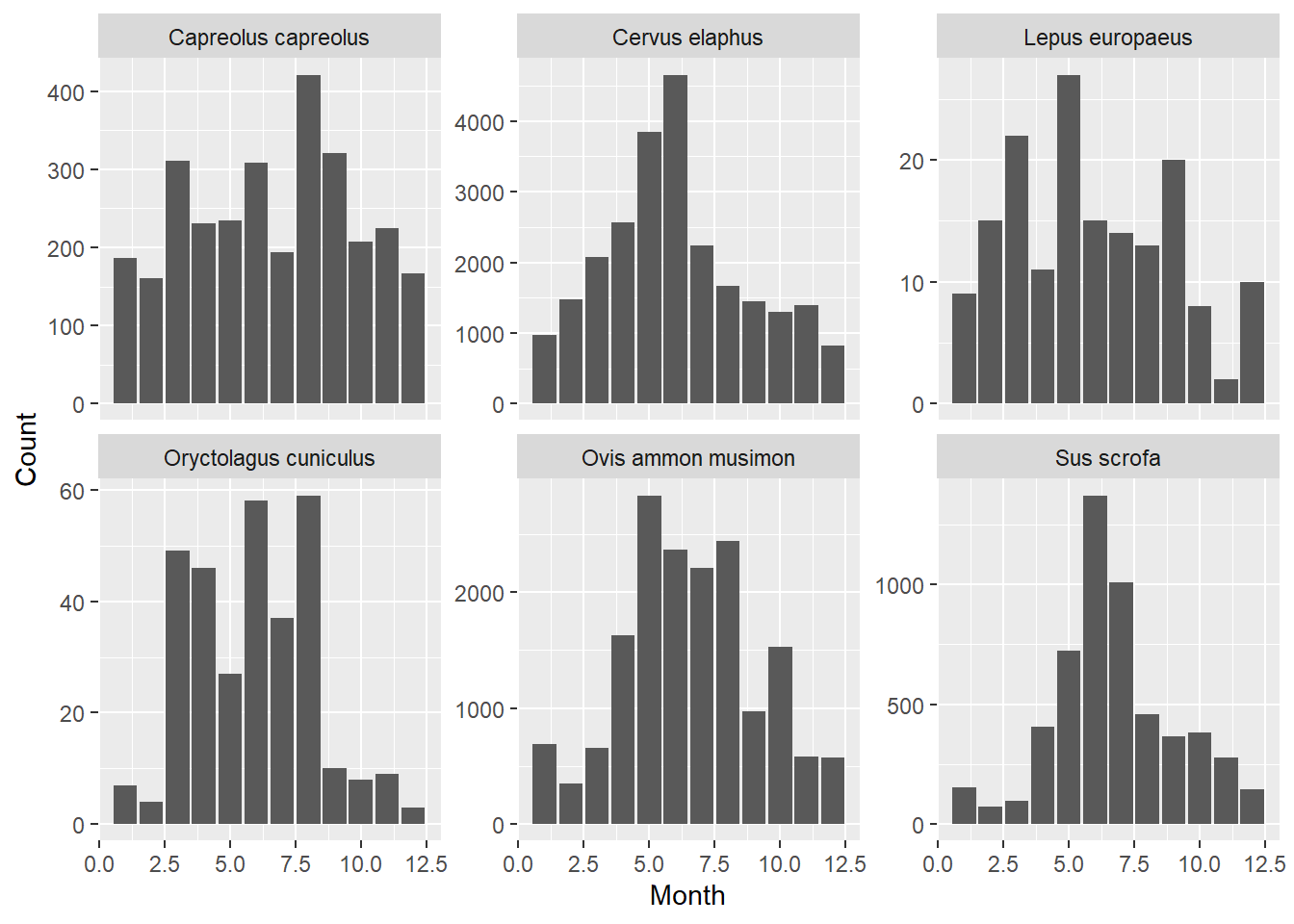
Exercise 4.7b
For the four most common species, create a 100% bar stacked bar chart of
the number of mammal observations in the dataset by month, segmented by
habitat. Each bar height is set to 100%. The (coloured) bar segments represent the proportion of each habitat to all observations.
# First get selection of four most abundant mammal species
selection <- obs %>%
  filter(Class == "Mammals") %>%
  group_by(Species) %>%
  summarise(sumCount = sum(Count)) %>%
  arrange(desc(sumCount)) %>%
  slice_head(n = 4) %>% # after arranging, this selects the top 4 rows
  pull(Species)

# Then, plot this selection of species
obs %>%
  mutate(Month = as.factor(Month)) %>%
  filter(Species %in% selection) %>%
  ggplot(mapping = aes(x = Month, y = Count, fill = Habitat)) +
  geom_bar(position = "fill", stat = "identity") +
  scale_y_continuous(labels = scales::percent_format()) +
  facet_wrap(~ Species, nrow = 2, scales = "free_y")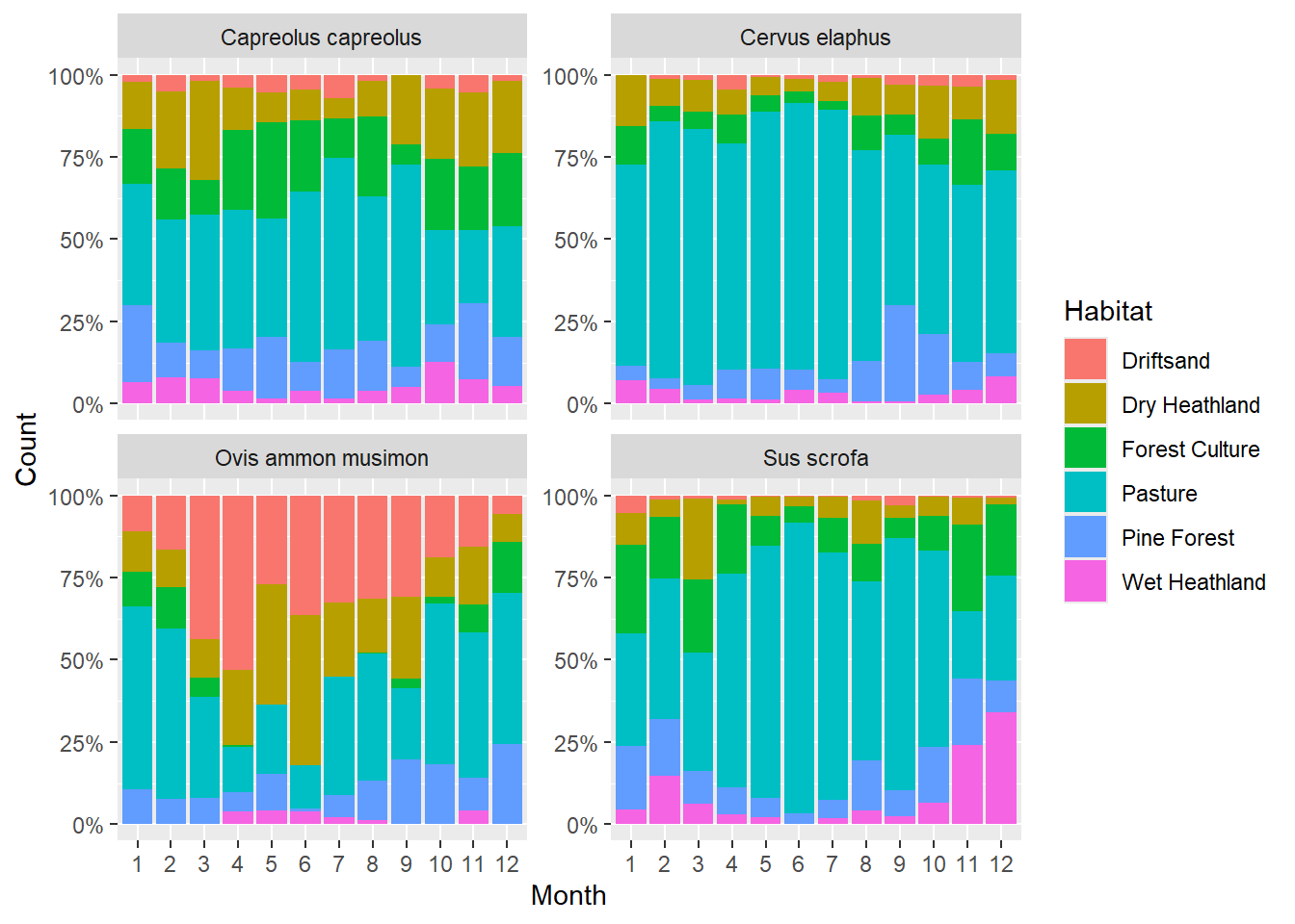
8 The distribution of Red deer
In this section, use the deer dataset:
“NPHV_deer_month_station.csv”.
Exercise 4.8a
Create a pie chart showing the distribution of all deer observations
over the six habitat types. Make clever use of the dplyr verbs and the pipe operator. For help on creating pie charts, see e.g. here
deer %>%
  group_by(Habitat) %>%
  summarise(total = sum(Total)) %>%
  ungroup() %>%
  ggplot(aes(x = "", y = total, fill = Habitat)) +
  geom_bar(width = 1, stat = "identity") +
  coord_polar("y", start = 0) +
  theme_void() # just to omit background and labels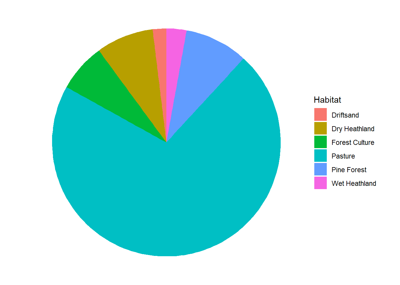
Exercise 4.8b
Create a 100% stacked bar to show how the distribution of deer over
habitats varies over the twelve months. Note: use the
obs data for this exercise! Do not focus on all species
present in this dataset, but only red deer “Cervus elaphus”.
In the code below, we use the percent_format function
from the “scales” package, to nicely format the axis values as
percentages:
library(scales)
obs %>%
  filter(Species == "Cervus elaphus") %>%
  mutate(Month = as.factor(Month)) %>%
  group_by(Month, Habitat) %>%
  summarise(sumCount = sum(Count)) %>%
  ggplot(mapping = aes(x = Month, y = sumCount, fill = Habitat)) +
    geom_bar(position = "fill", stat = "identity") +
    scale_y_continuous(labels = percent_format())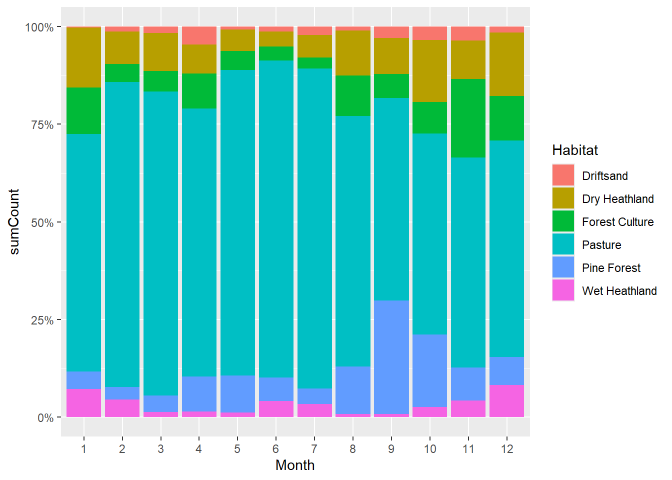
Exercise 4.8c
Create a pie chart showing the estimated actual distribution of deer
over the six habitats. Recall that the habitats were not sampled evenly,
so you must weigh the capture rates by the area of each habitat. The
area of the habitats is as follows: Driftsand 982.8; Wet Heathland
549.1; Dry Heathland 791.1; Pine Forest 1295.9; Forest Culture 1495.9;
Pasture 40.7. Compare with the pie chart from assignment 4.7, how does
it differ?. The function case_when in combination with
mutate can be of great help here.
deer %>%
  mutate(rate = Total / Effort_d) %>%
  group_by(Habitat) %>%
  summarise(mean_rate = mean(rate)) %>%
  mutate(area = case_when(Habitat == "Driftsand" ~ 982.8,
                          Habitat == "Wet Heathland" ~ 549.1,
                          Habitat == "Dry Heathland" ~ 791.1,
                          Habitat == "Pine Forest" ~ 1295.9,
                          Habitat == "Forest Culture" ~ 1495.9,
                          Habitat == "Pasture" ~ 40.7)) %>%
  mutate(mean_rate_weighed = mean_rate * area) %>%
  ggplot(aes(x = "", y = mean_rate_weighed, fill = Habitat)) +
    geom_bar(width = 1, stat = "identity") +
    coord_polar("y", start = 0) +
    theme_void() # just to omit background and labels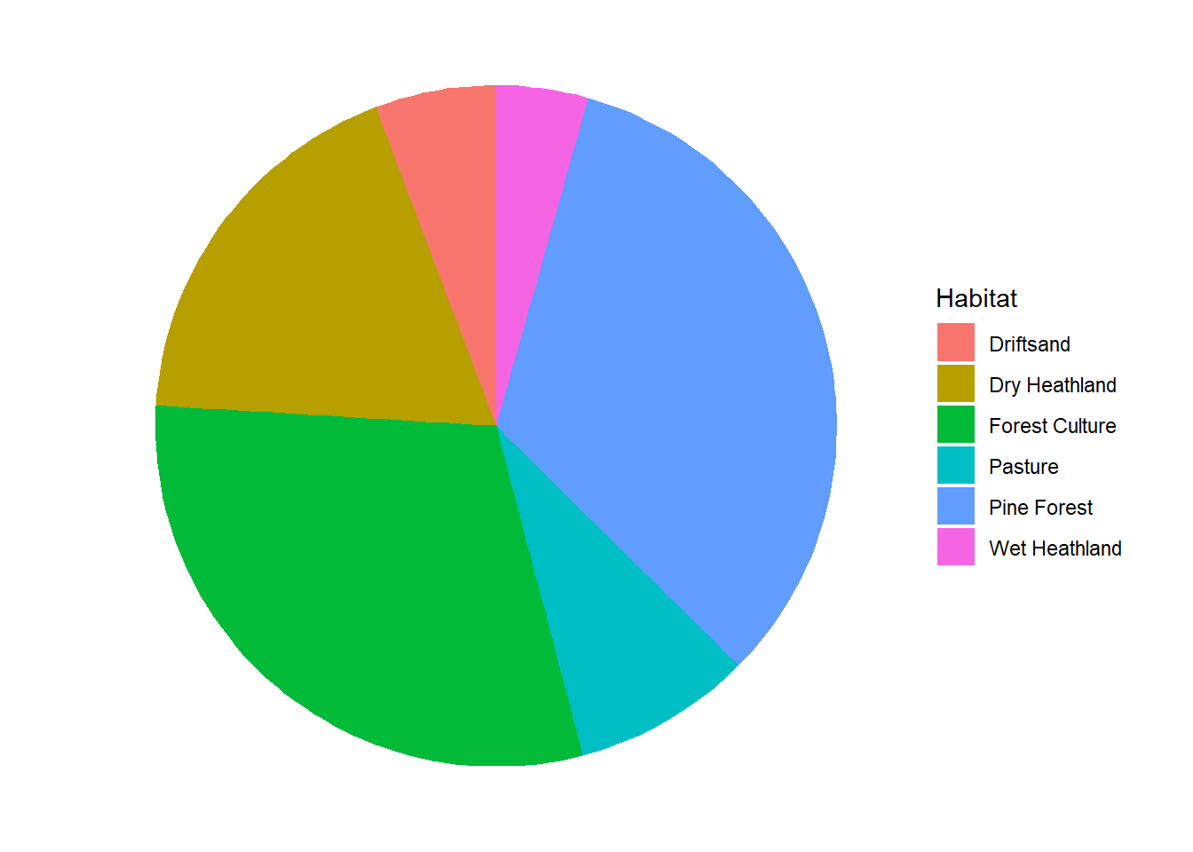
Exercise 4.8d
People believe that the deer use restricted area more intensely than
public area because they are afraid. Create a graph to compare the
capture rates of deer between the stations in restricted vs public area,
for each habitat. Try to make your graphs as informative as possible.
deer %>%
  mutate(rate = Total / Effort_d) %>%
  mutate(Restricted = as.logical(Restricted)) %>%
  group_by(Restricted, Habitat) %>%
  summarise(mean_rate = mean(rate),
            sd_rate = sd(rate)) %>%
  ungroup() %>%
  ggplot(mapping = aes(x = Restricted, y = mean_rate, group = Restricted)) +
  geom_col() +
  geom_errorbar(aes(ymin = mean_rate - sd_rate,
                    ymax = mean_rate + sd_rate),
                width = .1) + #sets whisker width
  facet_wrap(~Habitat, scales = "free") +
  ylab(bquote('Deer capture rate (d'^-1*')'))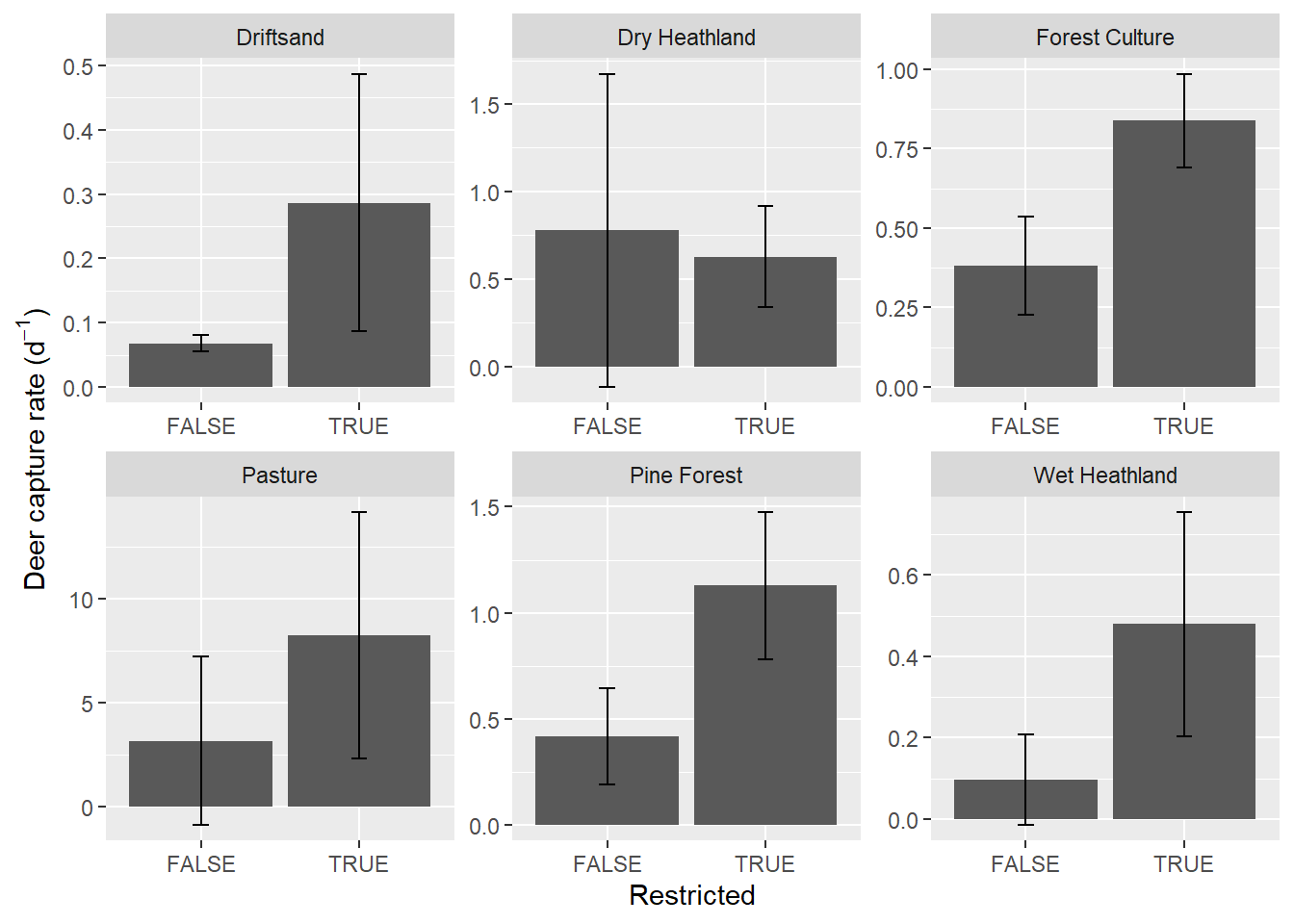
9 Challenge
Challenge: the Phylacine dataset
Use the dplyr verbs and pipes to explore the “Trait_data.csv” table
(download from Brightspace > Skills > Datasets >
Phylacine) from the PHYLACINE_1.2 dataset, the “The Phylogenetic
Atlas of Mammal Macroecology”. Try to reproduce the bar charts from
figure 3 from
Dirzo
et al. 2014 about “Defaunation in the Anthropocene”: 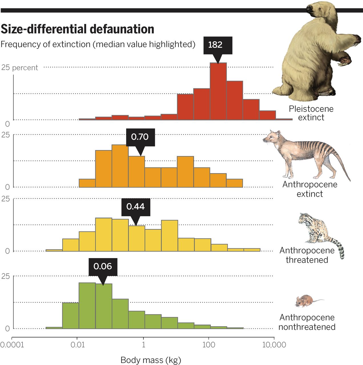
# Load data
traits <- read_csv("data/raw/phylacine/Trait_data.csv")

# Wrangle
d <- traits %>%
  select(Genus.1.2, IUCN.Status.1.2, Mass.g) %>%
  mutate(mass = Mass.g/1000) %>%
  mutate(status = case_when(
    IUCN.Status.1.2 %in% c("NE", "DD", "LC", "NT")~"Anthropocene non-threatened",
    IUCN.Status.1.2 %in% c("VU", "EN", "CR", "EW")~"Anthropocene threatened",
    IUCN.Status.1.2 == "EX"~"Anthropocene extinct",
    IUCN.Status.1.2 == "EP"~"Pleistocene extinct")) %>%
  mutate(status = factor(status, levels = c("Pleistocene extinct",
                                        "Anthropocene extinct",
                                        "Anthropocene threatened",
                                        "Anthropocene non-threatened")))
# Visualise
library(scales)
library(cowplot)
myfill <- c("#c83c27", "#ed9c22", "#f3cf44", "#97b34a")
mybreaks <- 10^seq(-4,5,.5)

ggplot(d) +
  geom_histogram(aes(y = stat(width*density), x = mass, fill = status),
                 col = "black",
                 #bins = 18,
                 breaks = mybreaks,
                 show.legend = F) +
  scale_x_log10(name = "Body mass (kg)",
                limits = c(0.0001, 100000),
                breaks = c(0.0001, 0.01, 1, 100, 10000),
                labels = c("0.0001", "0.01", "1", "100", "10.000"),
                expand = c(0,0)) +
  scale_y_continuous(name="",
                     limits = c(0, .25),
                     labels = c("0","","25"),
                     breaks = c(0, .125, .25),
                     expand = c(0,0)) +
  facet_wrap(~status, ncol =1) +              # One panel for each extinction status
  scale_fill_manual(values= myfill) +         # Sets the fill colour of the bars
  theme(panel.background = element_blank(),   # No coloured background
        panel.grid.minor = element_blank(),   # No minor gridlines
        panel.grid.major.x = element_blank(), # No vertical gridlines
        panel.grid.major.y = element_line(color = "gray60",linetype = "dotted"), # Dotted horizontal gridlines
        strip.background = element_blank(),   # Removes the facet title bar
        strip.text.x = element_blank(),       # Removed the facet title
        panel.spacing.y = unit(1, "lines"),   # Adds space between panels
        axis.line.y = element_line(colour = 'black', linetype='solid'),
        text = element_text(size = 14))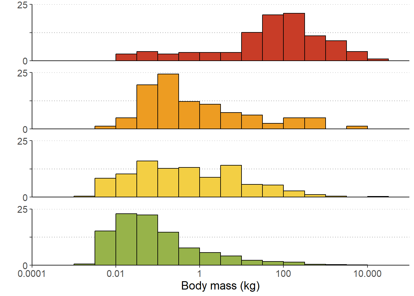
10 Submit your last plot
Submit your script file as well as a plot: either your last created plot, or a plot that best captures your solution to the challenge. Submit the files on Brightspace via Assessment > Assignments > Skills day 4.
Note that your submission will not be graded or evaluated. It is used only to facilitate interaction and to get insight into progress.
11 Recap
Today, we’ve practised the use of the pipe operator
%>% to efficiently chain the main functions from the
dplyr package into an efficient pipeline of data
transformation. Tomorrow, we will be joining the different tables from a
relational database.
An R script of today’s exercises can be downloaded here